MMM End-to-End Case Study#
In today’s competitive business landscape, optimizing marketing spend across channels is crucial for maximizing return on investment and driving business growth. This notebook demonstrates how to leverage PyMC-Marketing’s Media Mix Modeling (MMM) to gain actionable insights into marketing effectiveness and optimize budget allocation.
We’ll walk through a real-world case study using data from a PyData Global 2022 presentation (Hajime Takeda - Media Mix Modeling:How to Measure the Effectiveness of Advertising). Our goal is to show how MMM can help marketing teams:
Quantify the impact of different marketing channels on sales
Understand saturation effects and diminishing returns
Identify opportunities to reallocate budget for improved performance
Make data-driven decisions about future marketing investments
Outline
Data Preparation and Exploratory Analysis
Model Specification and Fitting
Model Diagnostics and Validation
Marketing Channel Deep Dive
Channel Contributions
Saturation Curves
Return on Ad Spend (ROAS)
Out-of-Sample Predictions
Budget Optimization
Key Takeaways and Next Steps
Note
In this notebook we guide you through what a typical MMM first iteration looks like (note that what a first iteration means depends on the business context). We focus on the application of the model for a concrete business case. If you want to know more about the model specification please refer to the MMM Example Notebook notebook.
Prepare Notebook#
We load the necessary libraries and set the notebook’s configuration.
import warnings

import arviz as az
import matplotlib.pyplot as plt
import matplotlib.ticker as mtick
import numpy as np
import pandas as pd
import pymc as pm
import seaborn as sns
import xarray as xr
from pymc_extras.prior import Prior

from pymc_marketing.metrics import crps
from pymc_marketing.mmm import GeometricAdstock, LogisticSaturation
from pymc_marketing.mmm.multidimensional import (
    MMM,
    MultiDimensionalBudgetOptimizerWrapper,
)

warnings.filterwarnings("ignore", category=FutureWarning)

az.style.use("arviz-darkgrid")
plt.rcParams["figure.figsize"] = [12, 7]
plt.rcParams["figure.dpi"] = 100

%load_ext autoreload
%autoreload 2
%config InlineBackend.figure_format = "retina"
seed: int = sum(map(ord, "mmm"))
rng: np.random.Generator = np.random.default_rng(seed=seed)
Load Data#
We load the data from a CSV file as a pandas DataFrame. We also do some light data cleaning following the filtering of the original case study. In essence, we are filtering and renaming certain marketing channels.
raw_df = pd.read_csv("https://raw.githubusercontent.com/sibylhe/mmm_stan/main/data.csv")

# 1. control variables
# We just keep the holidays columns
control_columns = [col for col in raw_df.columns if "hldy_" in col]


# 2. media variables
channel_columns_raw = sorted(
    [
        col
        for col in raw_df.columns
        if "mdsp_" in col
        and col != "mdsp_viddig"
        and col != "mdsp_auddig"
        and col != "mdsp_sem"
    ]
)


channel_mapping = {
    "mdsp_dm": "Direct Mail",
    "mdsp_inst": "Insert",
    "mdsp_nsp": "Newspaper",
    "mdsp_audtr": "Radio",
    "mdsp_vidtr": "TV",
    "mdsp_so": "Social Media",
    "mdsp_on": "Online Display",
}

channel_columns = sorted(list(channel_mapping.values()))

# 3. sales variables
sales_col = "sales"

data_df = raw_df[["wk_strt_dt", sales_col, *channel_columns_raw, *control_columns]]
data_df = data_df.rename(columns=channel_mapping)


# 4. Date column
data_df["wk_strt_dt"] = pd.to_datetime(data_df["wk_strt_dt"])
date_column = "wk_strt_dt"

# 5. Target variable
target_column = "sales"
Exploratory Data Analysis#
We should always start looking at the data! We can start by plotting the target variable, i.e. the sales.
Business Context: Understanding the sales patterns and trends is crucial for setting realistic expectations for marketing impact. The baseline sales level and seasonality patterns inform how much incremental lift we can expect from marketing activities.
fig, ax = plt.subplots()
sns.lineplot(data=data_df, x=date_column, y="sales", color="black", ax=ax)
ax.set(xlabel="date", ylabel="sales")
ax.set_title("Sales", fontsize=18, fontweight="bold");
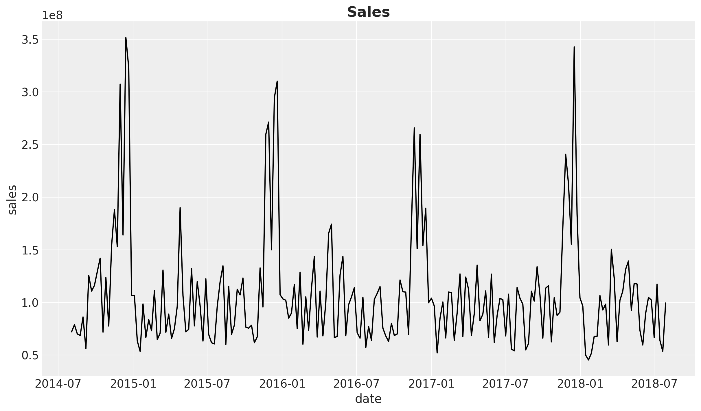
This time series, which comes in weekly granularity, has a clear yearly seasonality pattern and apparently a mild downward trend.
Next, let’s look into the marketing channels spend data. We first look into the share to get a feeling on the relative spend across channels.
fig, ax = plt.subplots()
data_df.melt(
    value_vars=channel_columns, var_name="channel", value_name="spend"
).groupby("channel").agg({"spend": "sum"}).sort_values(by="spend").plot.barh(ax=ax)
ax.set(xlabel="Spend", ylabel="Channel")
ax.set_title("Total Media Spend", fontsize=18, fontweight="bold");
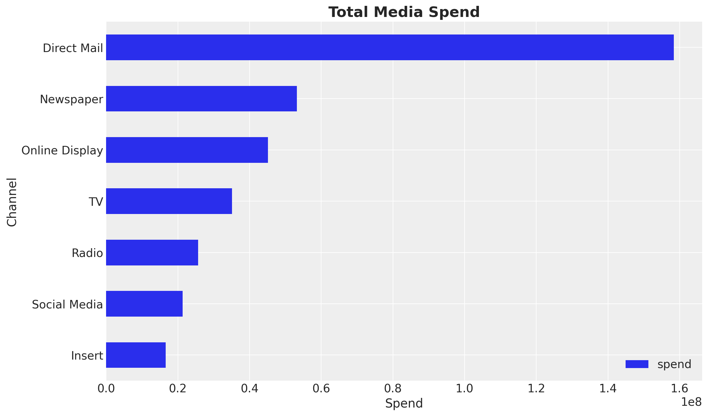
In this specific example we see that Direct Mail is the channel with the highest spend, followed by Newspaper and Online Display.
Business Context: Understanding the current budget allocation helps identify potential optimization opportunities. Channels with high spend but potentially low efficiency may be candidates for budget reallocation.
Note
Data Quality Consideration: The spend distribution may reflect historical budget decisions rather than optimal allocation. The MMM analysis will help determine if this allocation aligns with channel effectiveness.
Next, we look into the time series of each of the marketing channels.
fig, ax = plt.subplots()
data_df.set_index("wk_strt_dt")[channel_columns].plot(ax=ax)
ax.legend(title="Channel", fontsize=12)
ax.set(xlabel="Date", ylabel="Spend")
ax.set_title("Media Spend", fontsize=18, fontweight="bold");
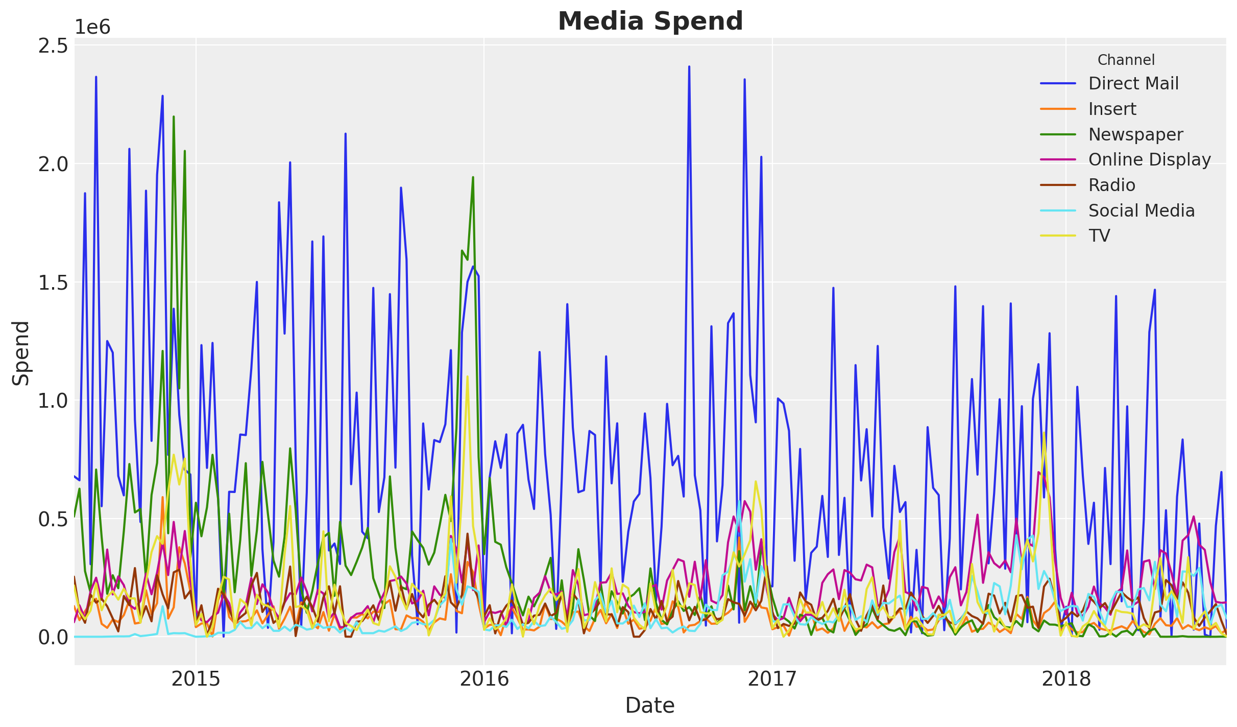
We see an overall decrease in spend over time. This might explain the downward trend in the sales time series.
Next, we can compute the correlation between the marketing channels and the sales.
Note
We all know that correlation does not imply causation. However, it is a good idea to look into the correlation between the marketing channels and the target variable. This can help us spot issues in the data (very common in real cases) and inspire some feature engineering.
Business Context: Understanding channel correlations helps identify potential budget allocation issues. High correlations between channels might indicate overlapping audiences or cannibalization effects, which are critical considerations when making budget decisions.
n_channels = len(channel_columns)

fig, axes = plt.subplots(
    nrows=n_channels,
    ncols=1,
    figsize=(15, 3 * n_channels),
    sharex=True,
    sharey=False,
    layout="constrained",
)

for i, channel in enumerate(channel_columns):
    ax = axes[i]
    ax_twin = ax.twinx()
    sns.lineplot(data=data_df, x=date_column, y=channel, color=f"C{i}", ax=ax)
    sns.lineplot(data=data_df, x=date_column, y=sales_col, color="black", ax=ax_twin)
    correlation = data_df[[channel, sales_col]].corr().iloc[0, 1]
    ax_twin.grid(None)
    ax.set(title=f"{channel} (Correlation: {correlation:.2f})")

ax.set_xlabel("date");
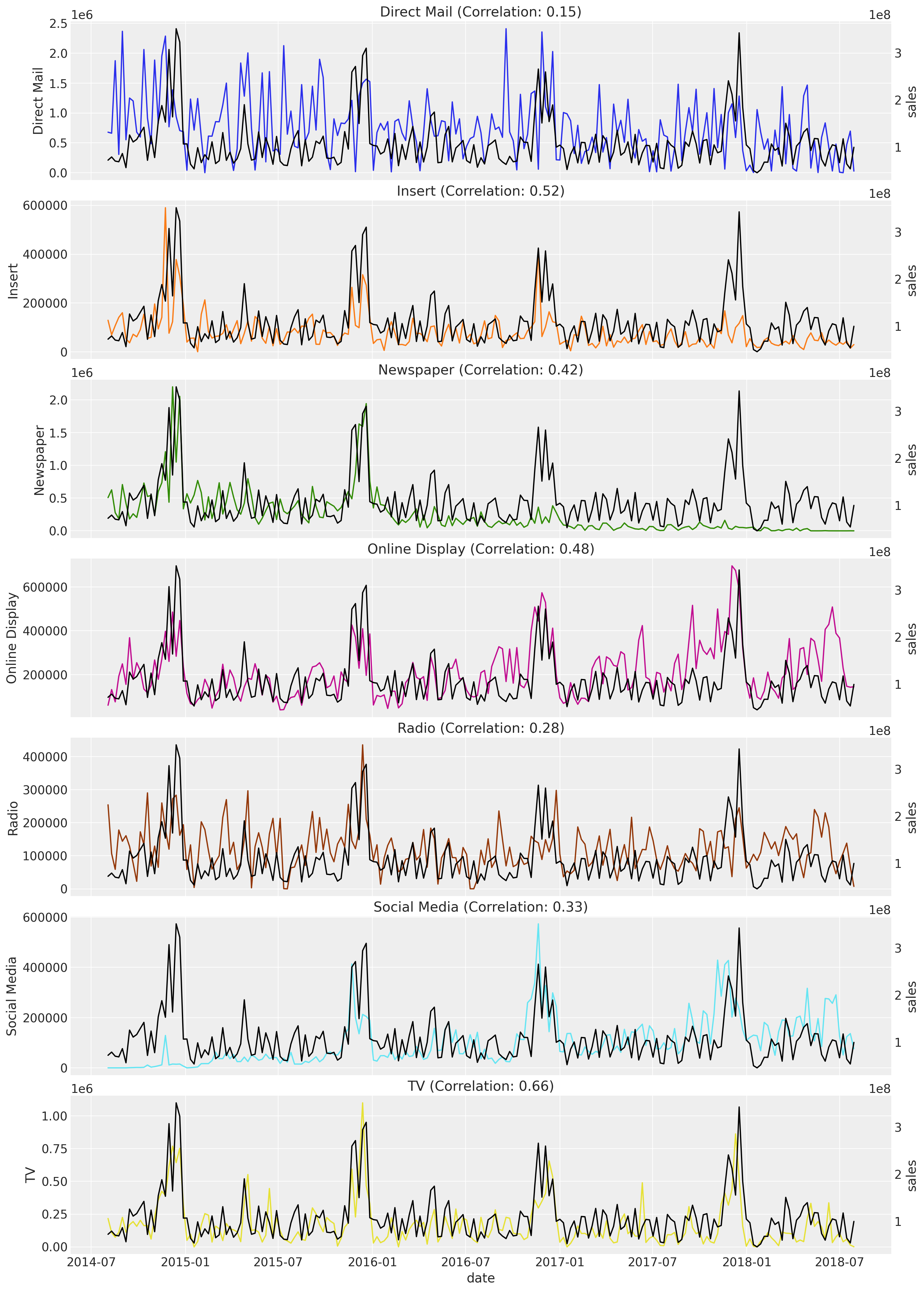
The channels with the highest correlation with the sales are TV, Insert, and Online Display. Observe that the biggest channel in spend, Direct Mail, has the lowest correlation.
Warning
Critical Assessment: Low correlation doesn’t necessarily mean low effectiveness. Direct Mail may have longer-term or indirect effects not captured by simple correlation. The MMM model will account for adstock effects and saturation, providing a more nuanced view of channel effectiveness than correlation alone.
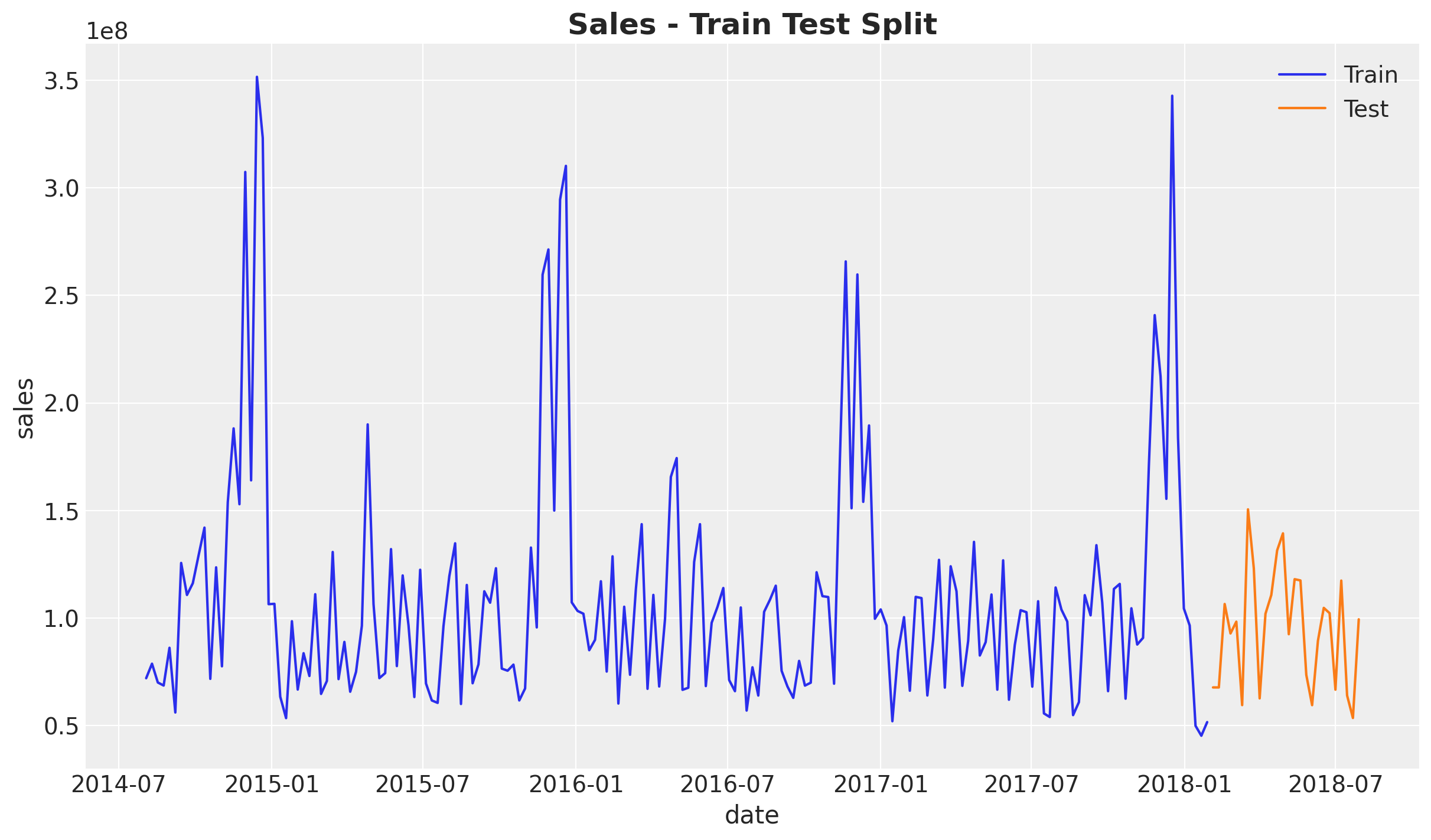
Train Test Split#
We are now ready to fit the model. We start by splitting the data into training and testing.
Note
In a real case scenario you should use more data for training than for testing (see Time-Slice-Cross-Validation and Parameter Stability). In this case we are using a small dataset for demonstrative purposes.
train_test_split_date = pd.to_datetime("2018-02-01")

train_mask = data_df.wk_strt_dt <= train_test_split_date
test_mask = data_df.wk_strt_dt > train_test_split_date

train_df = data_df[train_mask]
test_df = data_df[test_mask]

fig, ax = plt.subplots()
sns.lineplot(data=train_df, x="wk_strt_dt", y="sales", color="C0", label="Train", ax=ax)
sns.lineplot(data=test_df, x="wk_strt_dt", y="sales", color="C1", label="Test", ax=ax)
ax.set(xlabel="date")
ax.set_title("Sales - Train Test Split", fontsize=18, fontweight="bold");
X_train = train_df.drop(columns=sales_col)
X_test = test_df.drop(columns=sales_col)

y_train = train_df[sales_col]
y_test = test_df[sales_col]

print(f"Training set: {train_df.shape[0]} observations")
print(f"Test set: {test_df.shape[0]} observations")
Training set: 183 observations
Test set: 26 observations
Model Specification#
Assuming we are working on the first iteration, we typically would not have lift tests data to calibrate the model. This is fine, we can start with a spends priors to get started.
Tip
Ideally, in the next iteration we should have some of these lift tests to calibrate the model. For more details see Lift Test Calibration and the Case Study: Unobserved Confounders, ROAS and Lift Tests case study notebook.
The idea behind the spends priors is that we use the spend shares as a proxy for the effect of the media channels on the sales. This is not perfect but can be a good starting point. In essence, we are giving the higher spend channels more flexibility to fit the data with a wider prior. Let’s see how this looks like. First, we compute the spend shares (on the training data!).
Note
Why HalfNormal with spend shares as sigma?
We use HalfNormal(sigma=spend_shares) for the saturation_beta parameter (channel effectiveness) because:
Scale invariance: The spend shares are proportions (summing to 1), providing a natural scale relative to the data
Regularization: Channels with lower historical spend get tighter priors, reflecting our uncertainty about their true effectiveness given limited data
Flexibility for high-spend channels: Channels with more spend get wider priors, allowing the data to inform their effectiveness more freely
Non-negativity: HalfNormal ensures positive values, which is appropriate for effectiveness parameters
This approach encodes a reasonable prior belief: “We expect channel effectiveness to roughly follow historical investment patterns, but allow the data to update these beliefs.” Alternative approaches include using informative priors from industry benchmarks or lift test results.
spend_shares = (
    X_train.melt(value_vars=channel_columns, var_name="channel", value_name="spend")
    .groupby("channel", as_index=False)
    .agg({"spend": "sum"})
    .sort_values(by="channel")
    .assign(spend_share=lambda x: x["spend"] / x["spend"].sum())["spend_share"]
    .to_numpy()
)

prior_sigma = spend_shares
Next, we use these spend shares to set the prior of the model using the model configuration.
model_config = {
    "intercept": Prior("Normal", mu=0.2, sigma=0.05),
    "saturation_beta": Prior("HalfNormal", sigma=prior_sigma, dims="channel"),
    "saturation_lam": Prior("Gamma", alpha=3, beta=1, dims="channel"),
    "adstock_alpha": Prior("Beta", alpha=1, beta=3, dims="channel"),
    "gamma_control": Prior("Normal", mu=0, sigma=1, dims="control"),
    "gamma_fourier": Prior("Laplace", mu=0, b=1),
    "likelihood": Prior("TruncatedNormal", lower=0, sigma=Prior("HalfNormal", sigma=1)),
}
We are now ready to specify the model (see MMM Example Notebook for more details). As the yearly seasonal component is not that strong, we use few Fourier terms.
sampler_config = {"progressbar": True}

mmm = MMM(
    model_config=model_config,
    sampler_config=sampler_config,
    target_column=target_column,
    date_column=date_column,
    adstock=GeometricAdstock(l_max=6),
    saturation=LogisticSaturation(),
    channel_columns=channel_columns,
    control_columns=control_columns,
    yearly_seasonality=5,
)

mmm.build_model(X_train, y_train)

# Add the contribution variables to the model
# to track them in the model and trace.
mmm.add_original_scale_contribution_variable(
    var=[
        "channel_contribution",
        "control_contribution",
        "intercept_contribution",
        "yearly_seasonality_contribution",
        "y",
    ]
)

pm.model_to_graphviz(mmm.model)

Prior Predictive Checks#
We can now generate prior predictive samples to see how the model behaves under the prior specification.
# Generate prior predictive samples
mmm.sample_prior_predictive(X_train, y_train, samples=4_000)

# Custom plot for demonstration
fig, ax = plt.subplots()
sns.lineplot(
    data=train_df, x="wk_strt_dt", y="sales", color="black", label="Sales", ax=ax
)
for i, hdi_prob in enumerate([0.94, 0.5]):
    az.plot_hdi(
        x=mmm.model.coords["date"],
        y=(mmm.idata["prior"]["y_original_scale"].unstack().transpose(..., "date")),
        smooth=False,
        color="C0",
        hdi_prob=hdi_prob,
        fill_kwargs={"alpha": 0.3 + i * 0.1, "label": f"{hdi_prob:.0%} HDI"},
        ax=ax,
    )
ax.legend(loc="upper left")
ax.set(xlabel="date", ylabel="sales")
ax.set_title("Prior Predictive Checks", fontsize=18, fontweight="bold");
Sampling: [adstock_alpha, gamma_control, gamma_fourier, intercept_contribution, saturation_beta, saturation_lam, y, y_sigma]
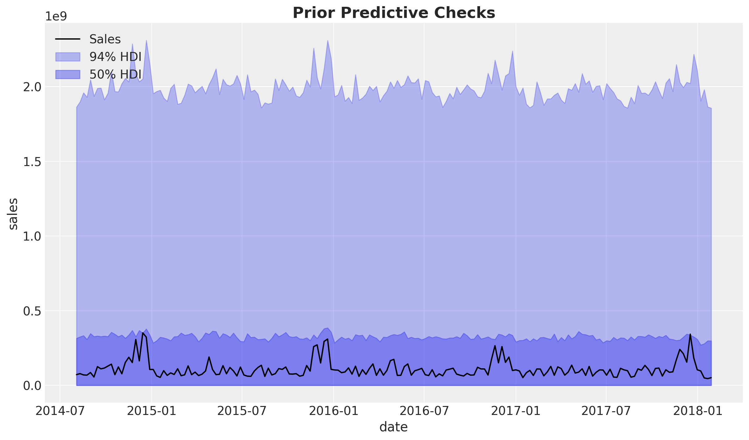
Overall, the priors are not very informative and the ranges is approximately one order of magnitude of the observed data. Note that the choice of likelihood as a truncated normal is to avoid negative values for the target variable.
Let’s look into the channel contribution share before fitting the model.
sum_contributions = mmm.idata["prior"]["channel_contribution"].sum(dim="date")
share_contributions = sum_contributions / sum_contributions.sum(dim="channel")

fig, ax = plt.subplots(figsize=(10, 6))
az.plot_forest(share_contributions, combined=True, ax=ax)
ax.xaxis.set_major_formatter(mtick.PercentFormatter(xmax=1, decimals=0))
fig.suptitle("Prior Channel Contribution Share", fontsize=18, fontweight="bold");
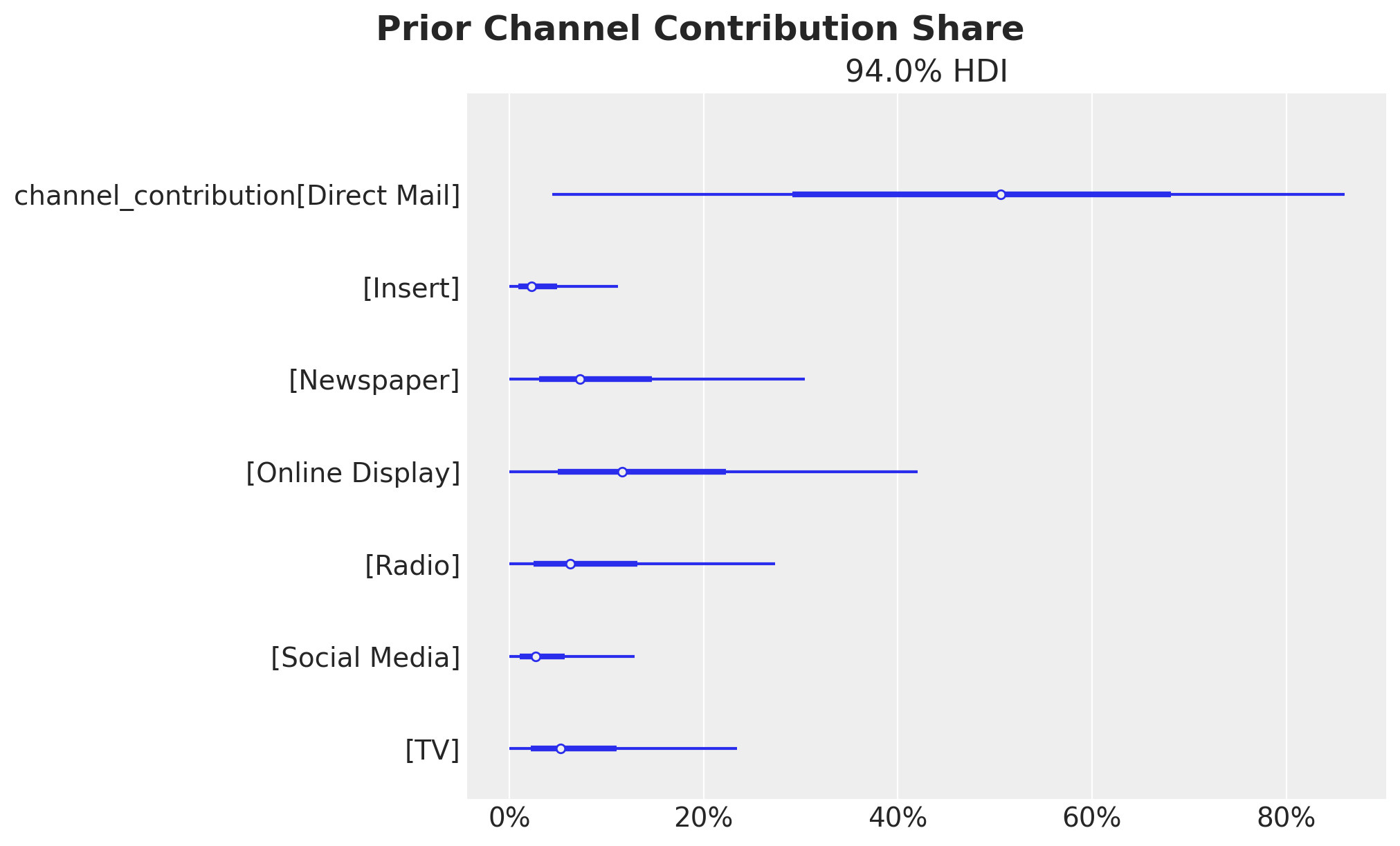
We confirm these represent the spend shares as expected from the prior specification.
Model Fitting#
We now fit the model to the training data.
Note
Model Assumptions: The MMM assumes that channel effects are additive and that saturation follows a logistic curve. In reality, channels may interact (synergy or cannibalization), and saturation curves may vary by channel characteristics. These assumptions should be validated through out-of-sample performance and business validation.
mmm.fit(
    X=X_train,
    y=y_train,
    target_accept=0.9,
    chains=6,
    draws=800,
    tune=1_500,
    nuts_sampler="nutpie",
    random_seed=rng,
)

mmm.sample_posterior_predictive(X=X_train, random_seed=rng)
Sampler Progress
Total Chains: 6
Active Chains: 0
Finished Chains: 6
Sampling for now
Estimated Time to Completion: now
| Progress | Draws | Divergences | Step Size | Gradients/Draw |
|---|---|---|---|---|
| 2300 | 0 | 0.15 | 95 | |
| 2300 | 0 | 0.15 | 63 | |
| 2300 | 0 | 0.13 | 31 | |
| 2300 | 0 | 0.16 | 31 | |
| 2300 | 0 | 0.15 | 31 | |
| 2300 | 0 | 0.14 | 31 |
Sampling: [y]
<xarray.Dataset> Size: 14MB
Dimensions:           (date: 183, sample: 4800)
Coordinates:
  * date              (date) datetime64[ns] 1kB 2014-08-03 ... 2018-01-28
  * sample            (sample) object 38kB MultiIndex
  * chain             (sample) int64 38kB 0 0 0 0 0 0 0 0 0 ... 5 5 5 5 5 5 5 5
  * draw              (sample) int64 38kB 0 1 2 3 4 5 ... 795 796 797 798 799
Data variables:
    y                 (date, sample) float64 7MB 0.3592 0.4291 ... 0.1835 0.2464
    y_original_scale  (date, sample) float64 7MB 1.263e+08 ... 8.665e+07
Attributes:
    created_at:                 2026-01-23T16:20:31.009740+00:00
    arviz_version:              0.23.0
    inference_library:          pymc
inference_library_version: 5.27.0Model Diagnostics#
Before looking into the results let’s check some diagnostics.
# Number of diverging samples
mmm.idata["sample_stats"]["diverging"].sum().item()

We do not have divergent transitions, which is good!
az.summary(
    data=mmm.idata,
    var_names=[
        "intercept_contribution",
        "y_sigma",
        "saturation_beta",
        "saturation_lam",
        "adstock_alpha",
        "gamma_control",
        "gamma_fourier",
    ],
)["r_hat"].describe()
count    55.000000
mean      1.000909
std       0.002901
min       1.000000
25%       1.000000
50%       1.000000
75%       1.000000
max       1.010000
Name: r_hat, dtype: float64
On the other hand, the R-hat statistics are all close to 1, which is also good!
Next let’s look into the model trace.
_ = az.plot_trace(
    data=mmm.fit_result,
    var_names=[
        "intercept_contribution",
        "y_sigma",
        "saturation_beta",
        "saturation_lam",
        "adstock_alpha",
        "gamma_control",
        "gamma_fourier",
    ],
    compact=True,
    backend_kwargs={"figsize": (12, 10), "layout": "constrained"},
)
plt.gcf().suptitle("Model Trace", fontsize=18, fontweight="bold");
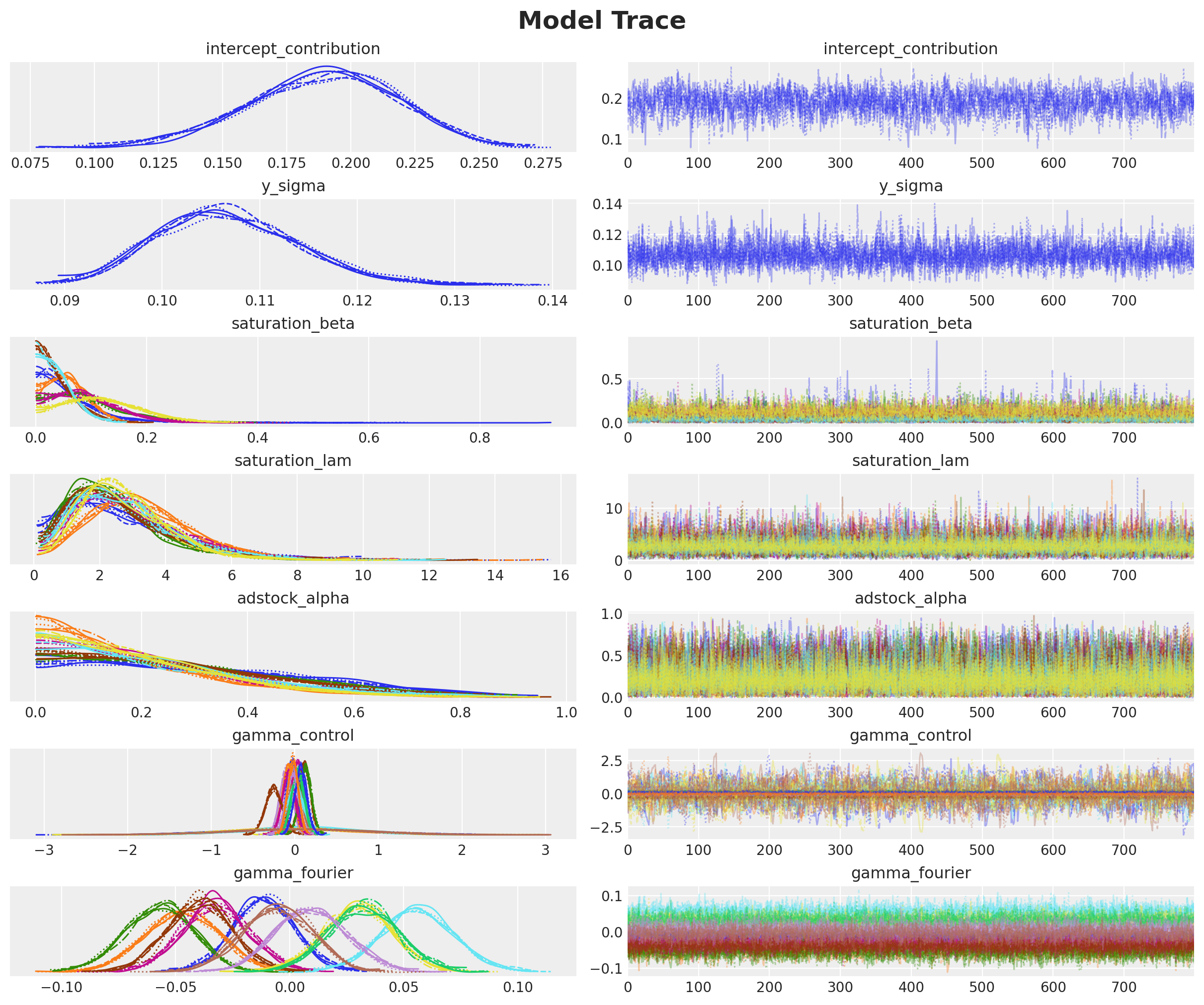
We see a good mixing in the trace, which is consistent with the good R-hat statistics.
Posterior Predictive Checks#
As our model and posterior samples are looking good, we can now look into the posterior predictive checks.
# Custom plot for demonstration
fig, ax = plt.subplots()

for i, hdi_prob in enumerate([0.94, 0.5]):
    az.plot_hdi(
        x=mmm.model.coords["date"],
        y=(mmm.idata["posterior_predictive"].y_original_scale),
        color="C0",
        smooth=False,
        hdi_prob=hdi_prob,
        fill_kwargs={"alpha": 0.3 + i * 0.1, "label": f"{hdi_prob:.0%} HDI"},
        ax=ax,
    )

sns.lineplot(
    data=train_df, x="wk_strt_dt", y="sales", color="black", label="Sales", ax=ax
)
ax.legend(loc="upper left")
ax.set(xlabel="date", ylabel="sales")
ax.set_title("Posterior Predictive Checks", fontsize=18, fontweight="bold");
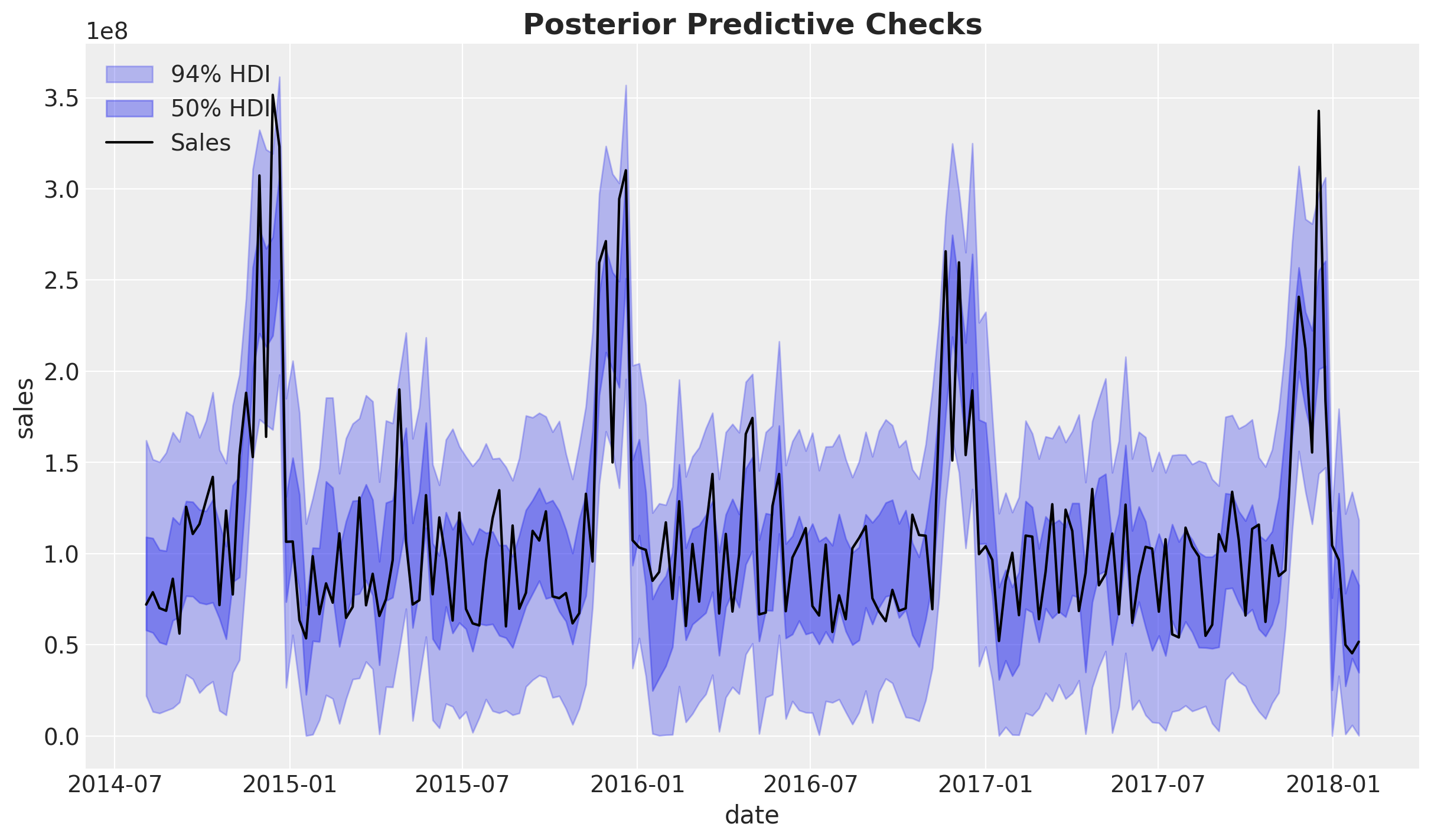
The posterior predictive sales look quite reasonable. We are explaining a good amount of the variance in the data and the trends are well captured.
Business Value: Good model fit indicates that the MMM can reliably attribute sales to marketing channels, which is essential for making confident budget allocation decisions.
We can look into the errors of the model:
# Custom error analysis
# true sales - predicted sales
errors = (
    y_train.to_numpy()[np.newaxis, np.newaxis, :]
    - mmm.idata["posterior"]["y_original_scale"]
)

fig, ax = plt.subplots()
for i, hdi_prob in enumerate([0.94, 0.5]):
    az.plot_hdi(
        x=mmm.model.coords["date"],
        y=errors,
        color="C3",
        smooth=False,
        hdi_prob=hdi_prob,
        fill_kwargs={"alpha": 0.3 + i * 0.1, "label": f"{hdi_prob:.0%} HDI"},
        ax=ax,
    )
sns.lineplot(
    x=mmm.model.coords["date"],
    y=errors.mean(dim=("chain", "draw")),
    color="C3",
    label="Posterior Mean",
    ax=ax,
)
ax.axhline(0, color="black", linestyle="--", linewidth=1)
ax.legend()
ax.set(xlabel="date", ylabel="error")
ax.set_title("Posterior Predictive Errors", fontsize=18, fontweight="bold");
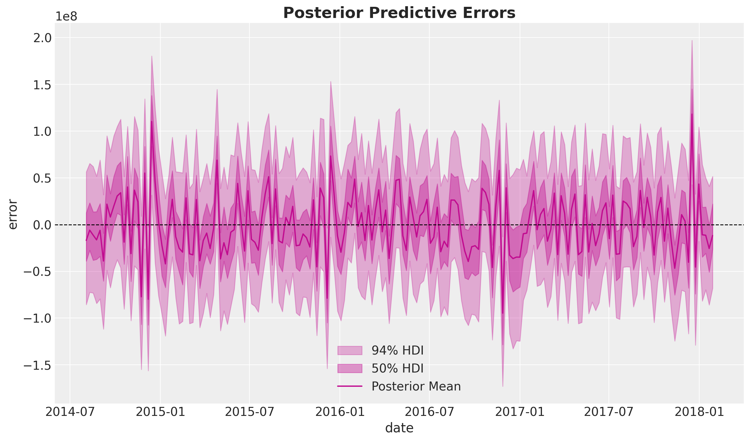
We do not detect any obvious patterns in the errors.
Note
Critical Assessment: While no obvious patterns are detected, it’s important to acknowledge that MMM models assume errors are normally distributed and independent. In practice, there may be unmodeled factors (e.g., competitor actions, economic shocks) that could introduce systematic biases. Regular model updates and validation are essential.
Media Deep Dive#
In this section we perform a deep dive into the media channels insights.
Channel Contributions#
Now that we are happy with the global model fit, we can look into the media and individual channels contributions.
We start by looking into the aggregated contributions.
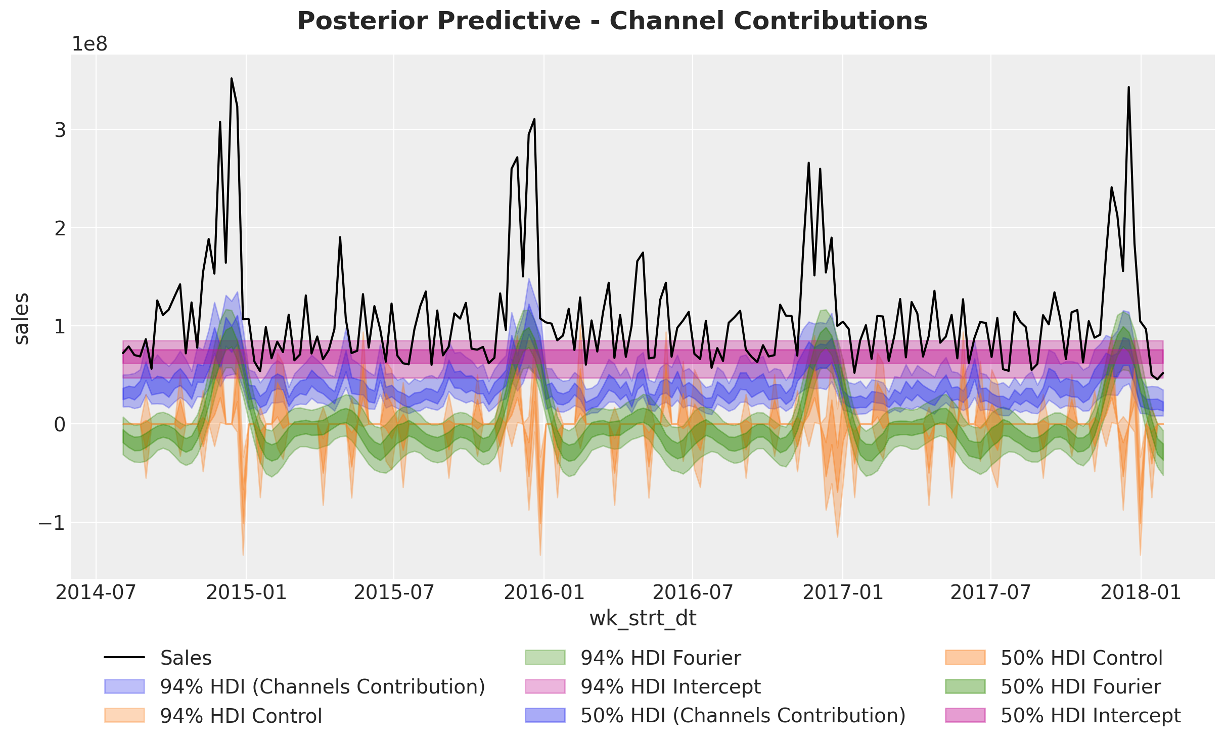
Next, we look deeper into the components:
fig, ax = mmm.plot.waterfall_components_decomposition(figsize=(18, 12))
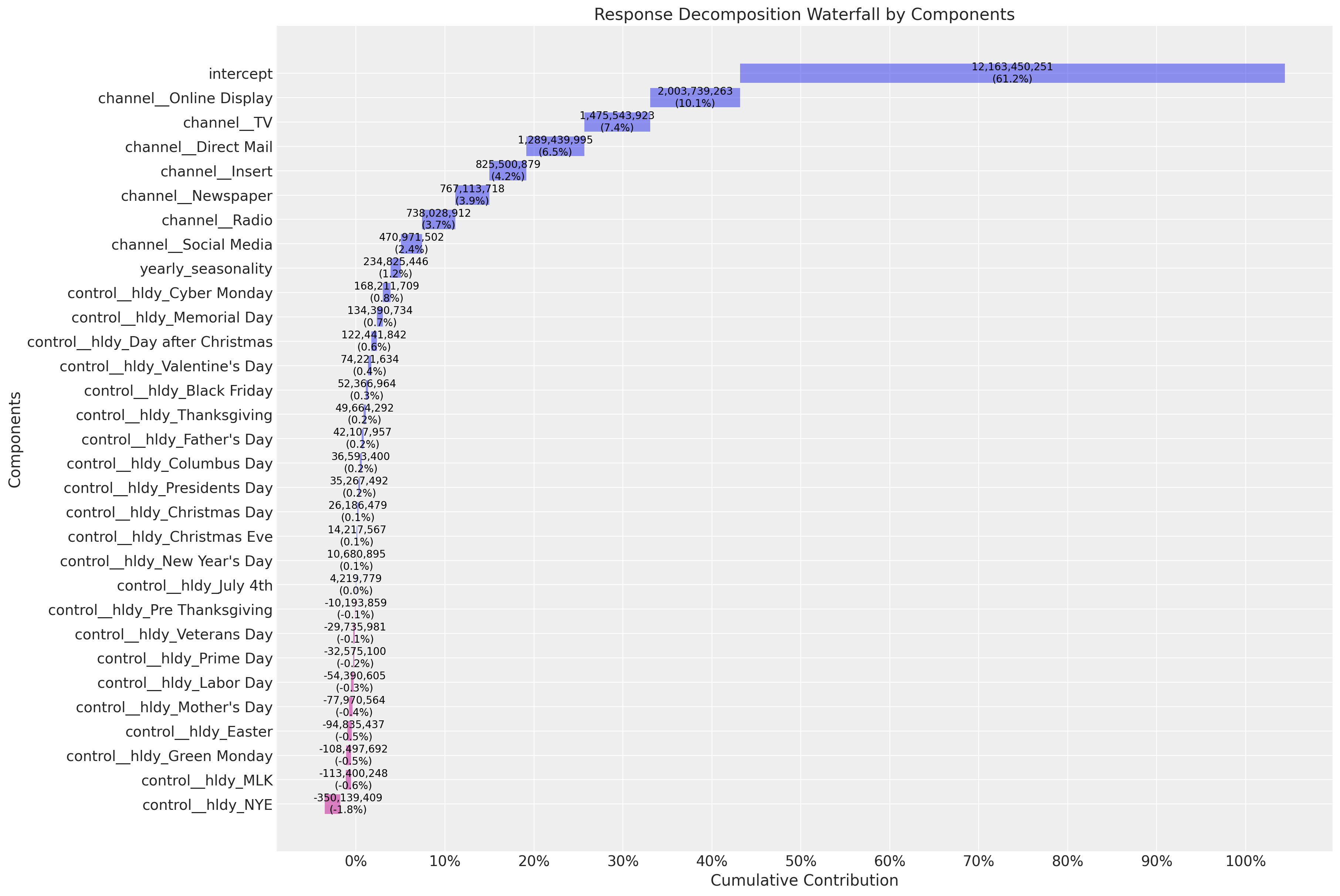
Here are some interesting observations about the model:
The
interceptaccounts for approximately \(60\%\) of the contribution. This is what people usually call the “baseline”.The top media contribution channels are
Online Display,Direct MailandTV. In some sense we see how the model is averaging the spend share (prior) and the predictive power of the media channels (posterior).
Business Value: The waterfall decomposition provides a clear visual summary of how different components contribute to sales. This is excellent for stakeholder presentations, as it shows both the baseline (intercept) and the incremental impact of marketing activities. Understanding that ~60% of sales come from baseline helps set realistic expectations for marketing-driven growth.
Saturation Curves#
We continue our analysis by looking into the direct response curves. These will be the main input for the budget optimization step below.
mmm.plot.saturation_scatterplot(
    width_per_col=12, height_per_row=4, original_scale=True
);
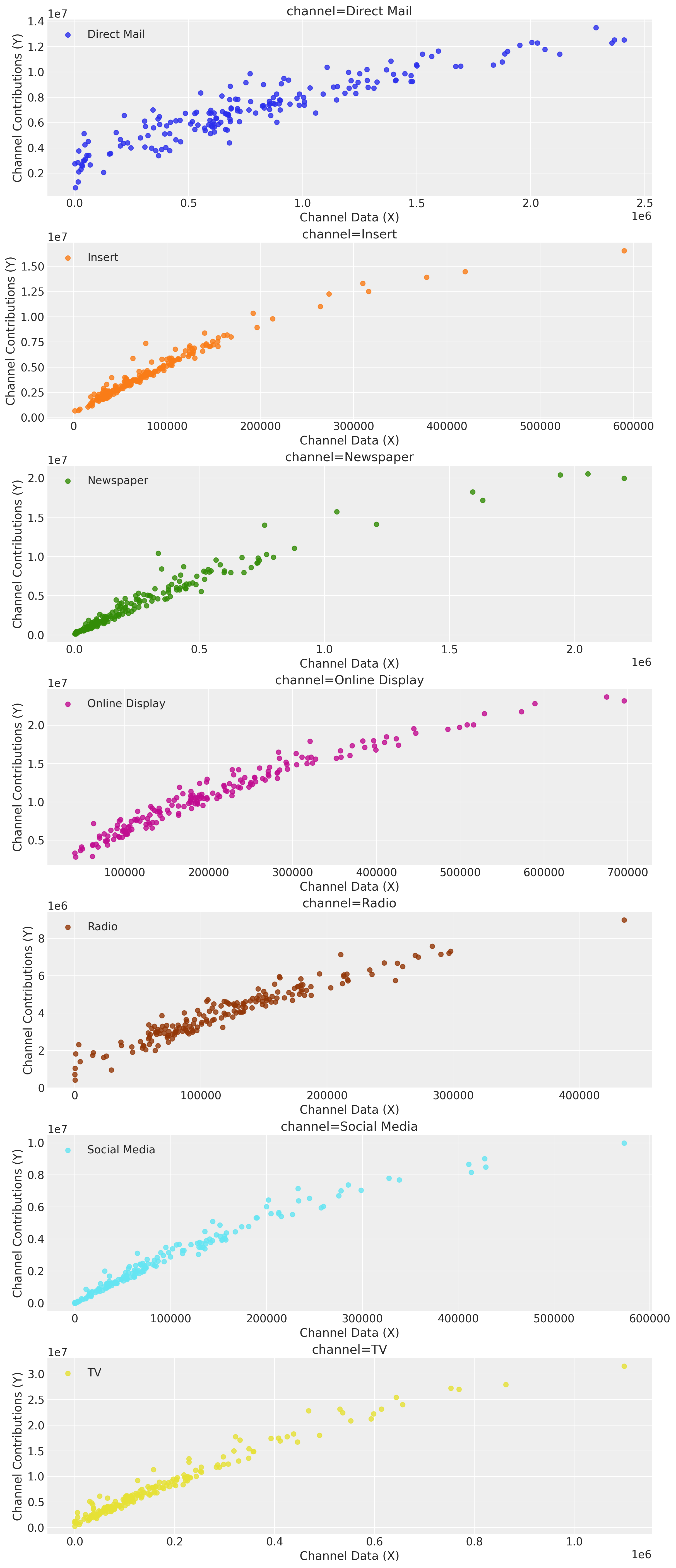
Tip
These curves by themselves can be a great input for marketing planning! One could use them to set the budget for the next periods and manually optimize the spend for these channels depending on the saturation points. This process can be a good starting point to engage with the team. That being said, we can do better with custom optimization routines as described in the following sections.
Beside the direct response curves, we can look intro global contribution plots simulations. The idea is to vary the spend by globally multiplying the time series spend by a value \(\text{sweep} > 0\) and seeing the expected contribution. PyMC-Marketing also shows the \(94\%\) Highest Density Interval (HDI) of the simulations results.
# Here we set scenarios to sweep over
# a 10% to 200% of the historical spend.
sweeps = np.linspace(0, 1.5, 16)
mmm.sensitivity.run_sweep(
    sweep_values=sweeps,
    var_input="channel_data",
    var_names="channel_contribution_original_scale",
    extend_idata=True,
)
ax = mmm.plot.sensitivity_analysis(
    xlabel="Sweep multiplicative",
    ylabel="Total contribution over training period",
    hue_dim="channel",
    x_sweep_axis="relative",
    subplot_kwargs={"nrows": 2, "figsize": (12, 8)},
)

ax.axvline(1.0, color="black", linestyle="--", linewidth=1);
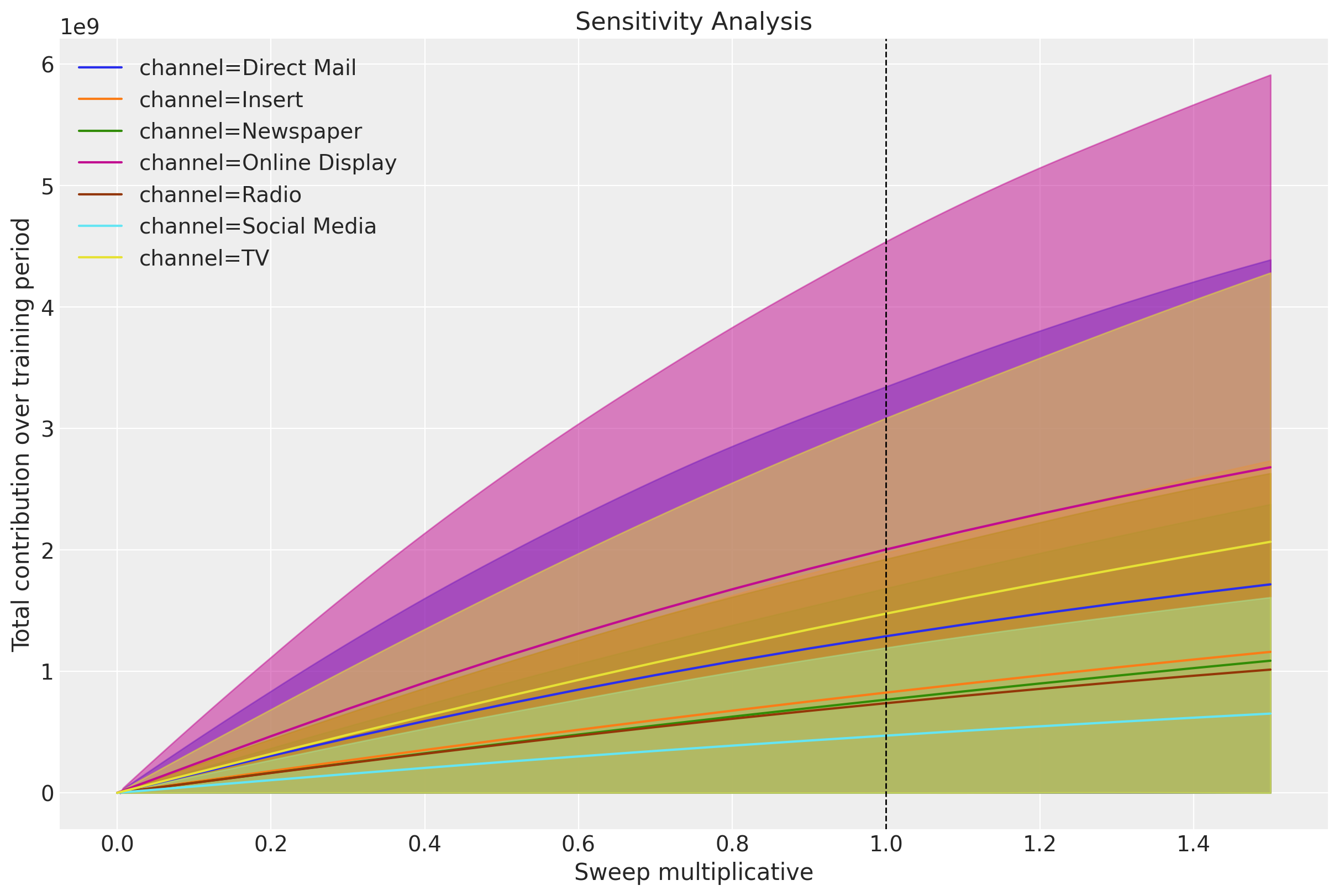
We can clearly see the saturation effects for the different channels.
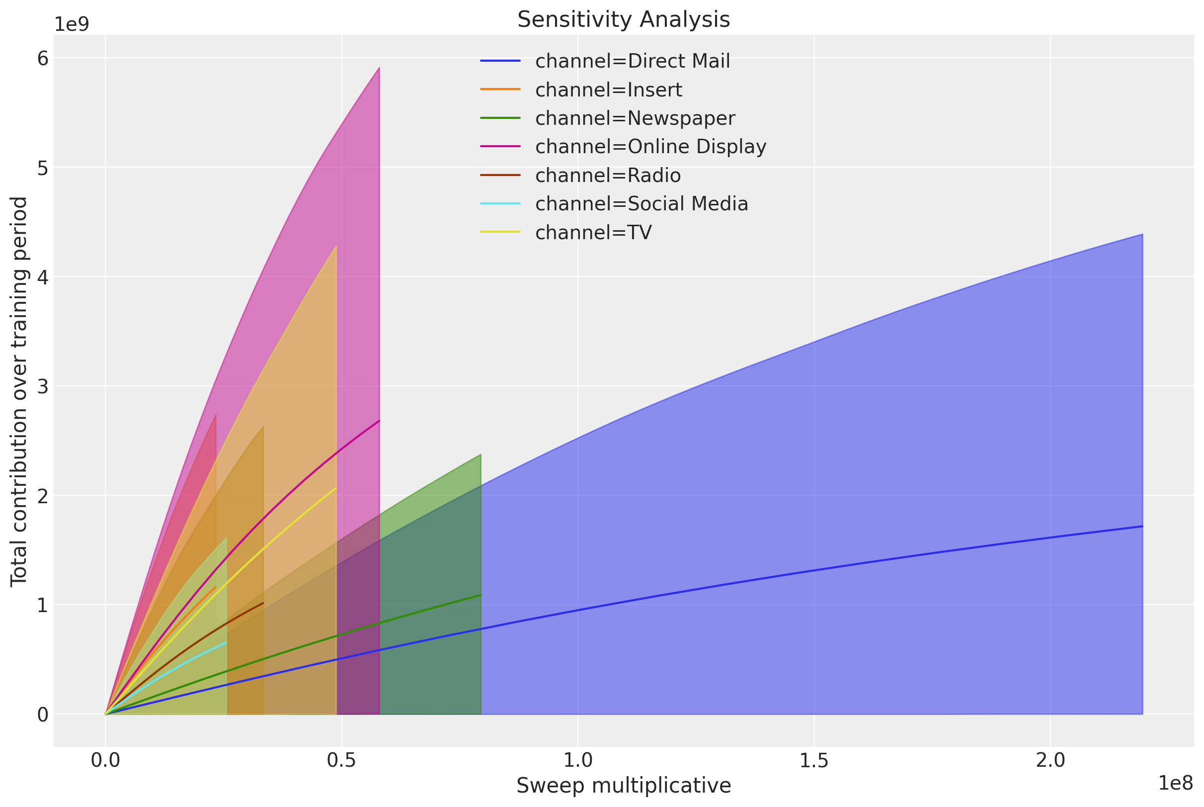
A complementary plot is to plot these same simulations against the actual spend:
ax = mmm.plot.sensitivity_analysis(
    xlabel="Sweep multiplicative",
    ylabel="Total contribution over training period",
    hue_dim="channel",
    x_sweep_axis="absolute",
    subplot_kwargs={"nrows": 2, "figsize": (12, 8)},
)
In many cases we want to be able to create custom plots to make these insights more digestible. The following code shows how to extract the data to create your own plots.
We can now create our own plots. Here is an example:
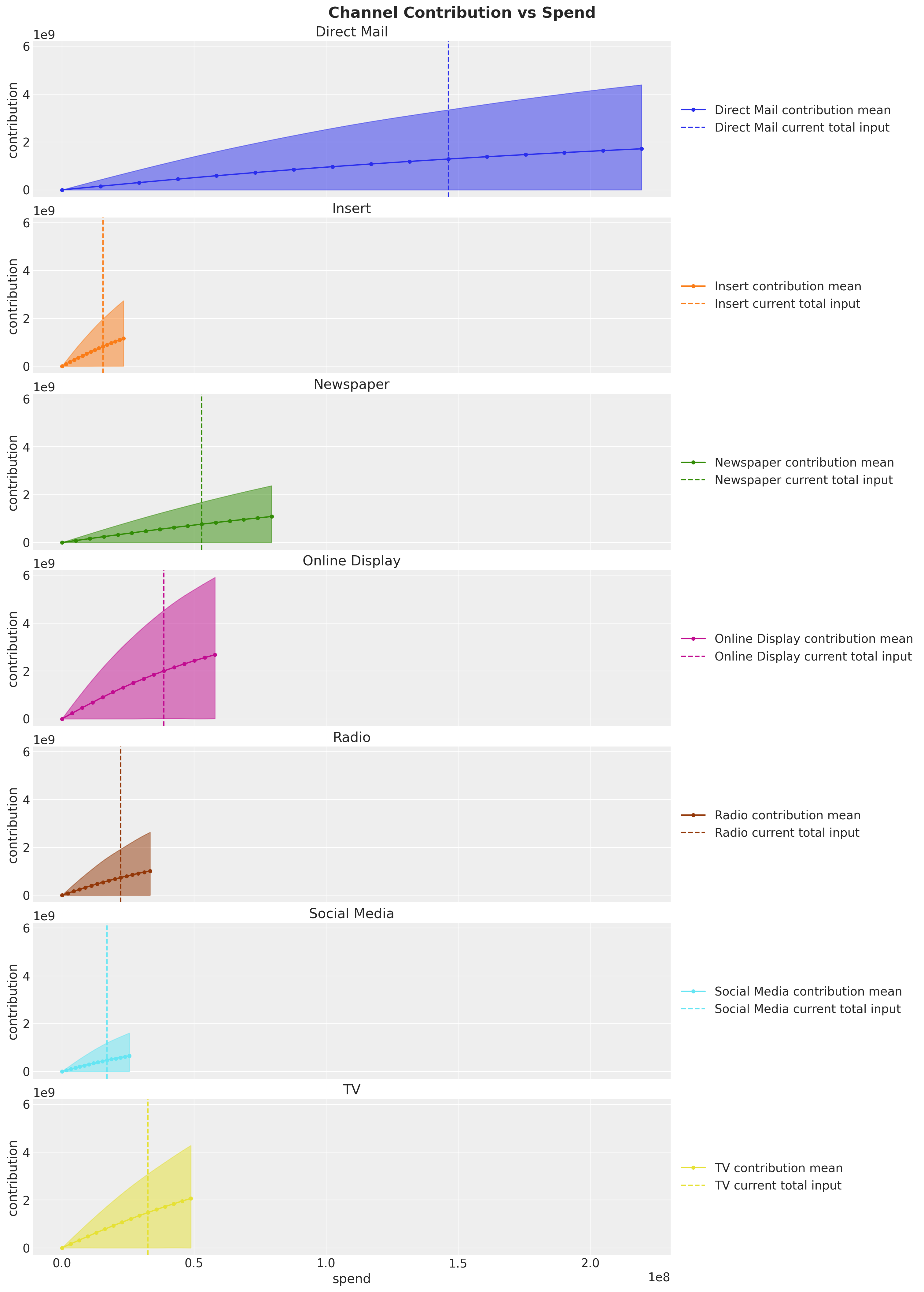
The vertical lines show the spend from the observed data (i.e. \(\text{sweep} = 1 \) above). This plot clearly shows that, for example, Direct Mail won’t have much incremental contribution if we keep increasing the spend. On the other hand, channels like Online Display and Insert seem to be good candidates to increase the spend. These are the concrete actionable insights you can extract from these types of models to optimize your media spend mix 🚀!
Return on Ads Spend (ROAS)#
To have a more quantitative metric of efficiency we compute the Return on Ads Spend (ROAS) over the whole training period.
To begin lets plot the contribution share for each channel.
channel_contribution_share = (
    mmm.idata["posterior"]["channel_contribution_original_scale"].sum(dim="date")
) / mmm.idata["posterior"]["channel_contribution_original_scale"].sum(
    dim=("date", "channel")
)

# Custom plot for demonstration
fig, ax = plt.subplots()
az.plot_forest(channel_contribution_share, combined=True, ax=ax)
ax.xaxis.set_major_formatter(mtick.PercentFormatter(xmax=1, decimals=0))
fig.suptitle("Posterior Channel Contribution Share", fontsize=18, fontweight="bold");
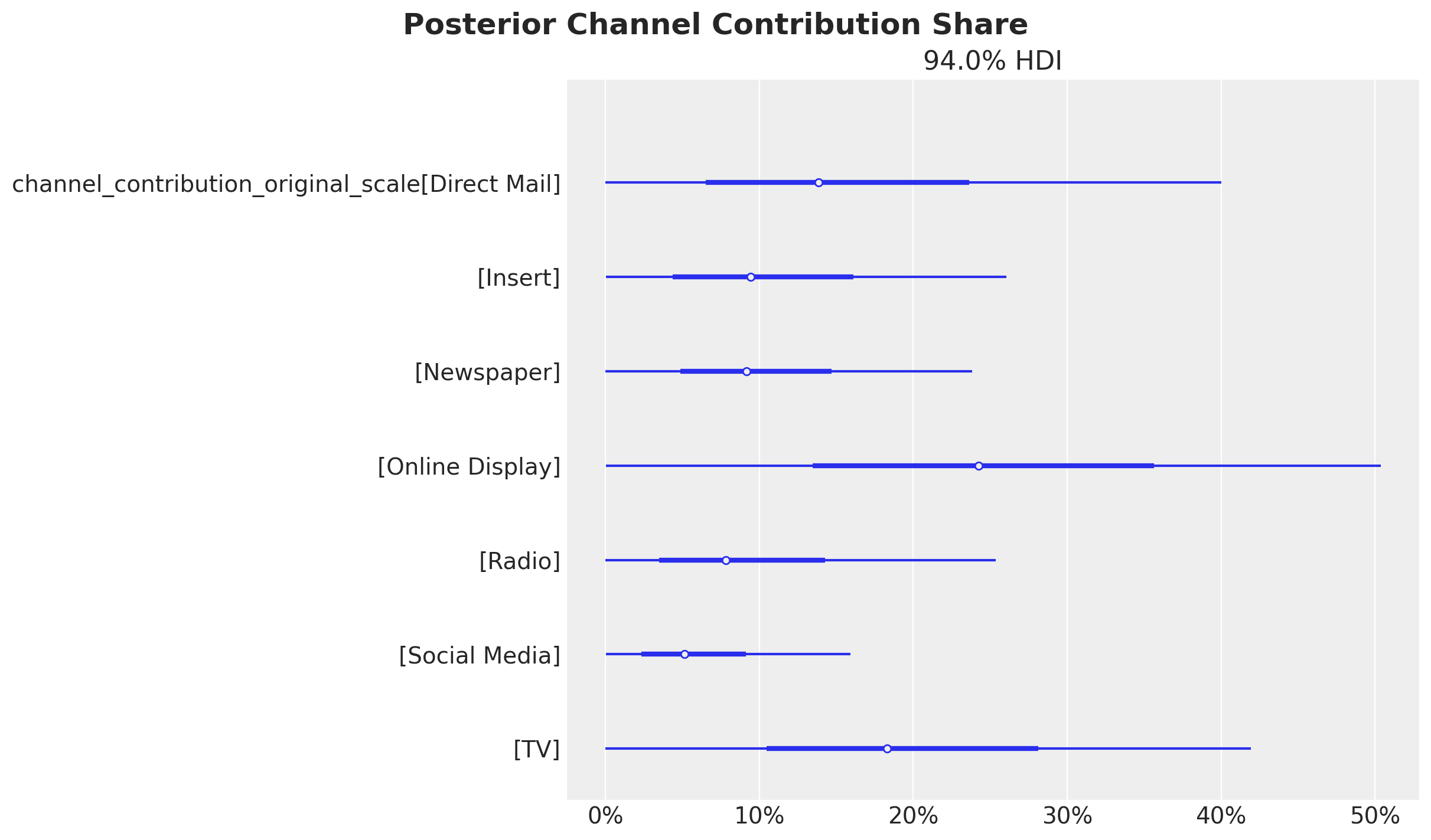
These contributions are of course influenced by the spend levels. If we want to get a better picture of the efficiency of each channel we need to look into the Return on Ads Spend (ROAS). This is done by computing the ratio of the mean contribution and the spend for each channel.
Business Value: ROAS metrics translate directly to budget allocation decisions. Channels with higher ROAS indicate better efficiency and should be prioritized for budget increases, while low ROAS channels may need budget reduction or strategic reconsideration.
# Get the channel contributions on the original scale
channel_contribution_original_scale = mmm.idata["posterior"][
    "channel_contribution_original_scale"
]

# Sum the contributions over the whole training period
spend_sum = X_train[channel_columns].sum().to_numpy()
spend_sum = spend_sum[
    np.newaxis, np.newaxis, :
]  # We need these extra dimensions to broadcast the spend sum to the shape of the contributions.

# Compute the ROAS as the ratio of the mean contribution and the spend for each channel
roas_samples = channel_contribution_original_scale.sum(dim="date") / spend_sum

# Plot the ROAS
fig, ax = plt.subplots(figsize=(10, 6))
az.plot_forest(roas_samples, combined=True, ax=ax)
fig.suptitle("Return on Ads Spend (ROAS)", fontsize=18, fontweight="bold");
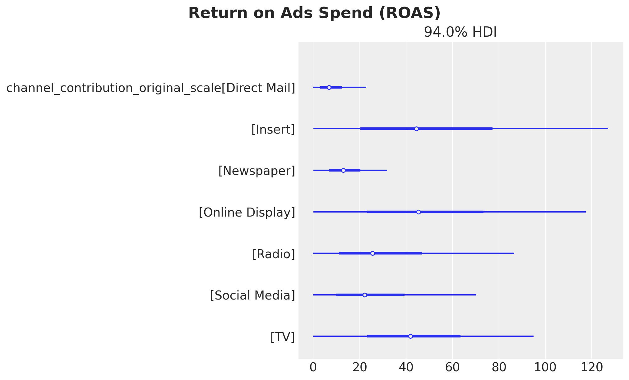
Here we see that the channels with the highest ROAS on average are Online Display and Insert whereas Direct Mail has the lowest ROAS. This is consistent with the previous findings analyzing the direct and global response curves.
Business Value: ROAS metrics directly inform budget allocation decisions. Channels with higher ROAS should receive priority for budget increases, while low ROAS channels may need strategic reconsideration. However, it’s important to consider both efficiency (ROAS) and scale (contribution share) when making allocation decisions.
Tip
The large HDI intervals for the ROAS for the top channels come from the fact that the spend share of them during the training period is relatively small. Even though we use the spend share as priors, the overall spend levels are also reflected in the estimate (see for example how small the HDI is for Direct Mail).
We can see this as an opportunity! Based on this analysis we see that Online Display and Insert are the best channels to invest in. Hence, if we optimize our budget accordingly (more on the budget optimization below) we can improve our marketing mix and at the same time create more variance in the training data so that we get refined ROAS estimates for future iterations 😎.
Warning
Uncertainty in ROAS Estimates: The wide HDI intervals for high-ROAS channels reflect uncertainty due to limited historical spend. While these channels show promise, budget increases should be implemented gradually with careful monitoring to validate the model’s predictions.
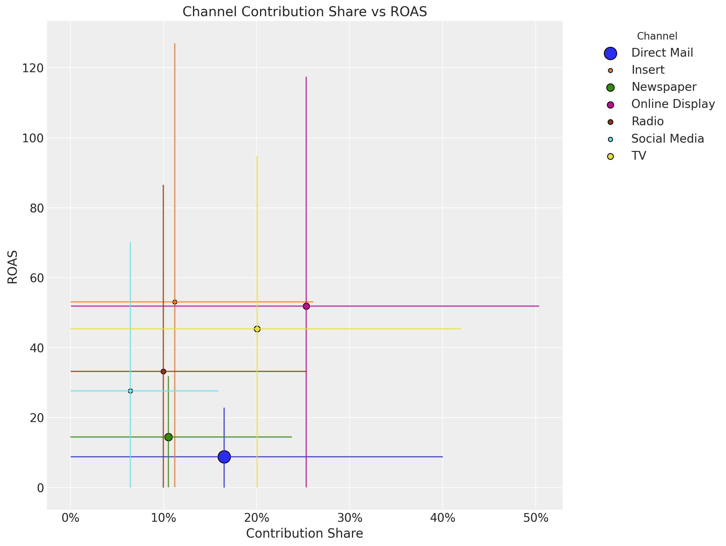
It is also useful to compare the ROAS and the contribution share.
# Get the contribution share samples
channel_contribution_share

fig, ax = plt.subplots(figsize=(12, 9))

for i, channel in enumerate(channel_columns):
    # Contribution share mean and hdi
    share_mean = channel_contribution_share.sel(channel=channel).mean().to_numpy()
    share_hdi = az.hdi(channel_contribution_share.sel(channel=channel))[
        "channel_contribution_original_scale"
    ].to_numpy()

    # ROAS mean and hdi
    roas_mean = roas_samples.sel(channel=channel).mean().to_numpy()
    roas_hdi = az.hdi(roas_samples.sel(channel=channel))[
        "channel_contribution_original_scale"
    ].to_numpy()

    # Plot the contribution share hdi
    ax.vlines(share_mean, roas_hdi[0], roas_hdi[1], color=f"C{i}", alpha=0.8)

    # Plot the ROAS hdi
    ax.hlines(roas_mean, share_hdi[0], share_hdi[1], color=f"C{i}", alpha=0.8)

    # Plot the means
    ax.scatter(
        share_mean,
        roas_mean,
        # Size of the scatter points is proportional to the spend share
        s=5 * (spend_shares[i] * 100),
        color=f"C{i}",
        edgecolor="black",
        label=channel,
    )
ax.xaxis.set_major_formatter(mtick.PercentFormatter(xmax=1, decimals=0))

ax.legend(
    bbox_to_anchor=(1.05, 1), loc="upper left", title="Channel", title_fontsize=12
)
ax.set(
    title="Channel Contribution Share vs ROAS",
    xlabel="Contribution Share",
    ylabel="ROAS",
);
Out-of-Sample Predictions#
Until now we have analyzed the model fit from the in-sample perspective. If we want to follow the model recommendations, we need to have evidence that the model is not only good in explaining the past but also good at making predictions. This is a key component to getting the buy in from the business stakeholders.
The PyMC-Marketing MMM API allows to easily generate out-of-sample predictions from a fitted model as follows:
y_pred_test = mmm.sample_posterior_predictive(
    X_test,
    include_last_observations=True,
    var_names=["y_original_scale", "channel_contribution_original_scale"],
    extend_idata=False,
    progressbar=False,
    random_seed=rng,
)
Sampling: [y]
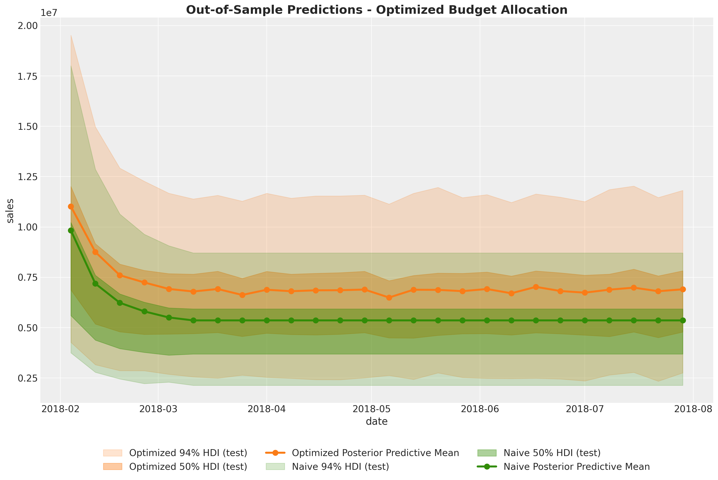
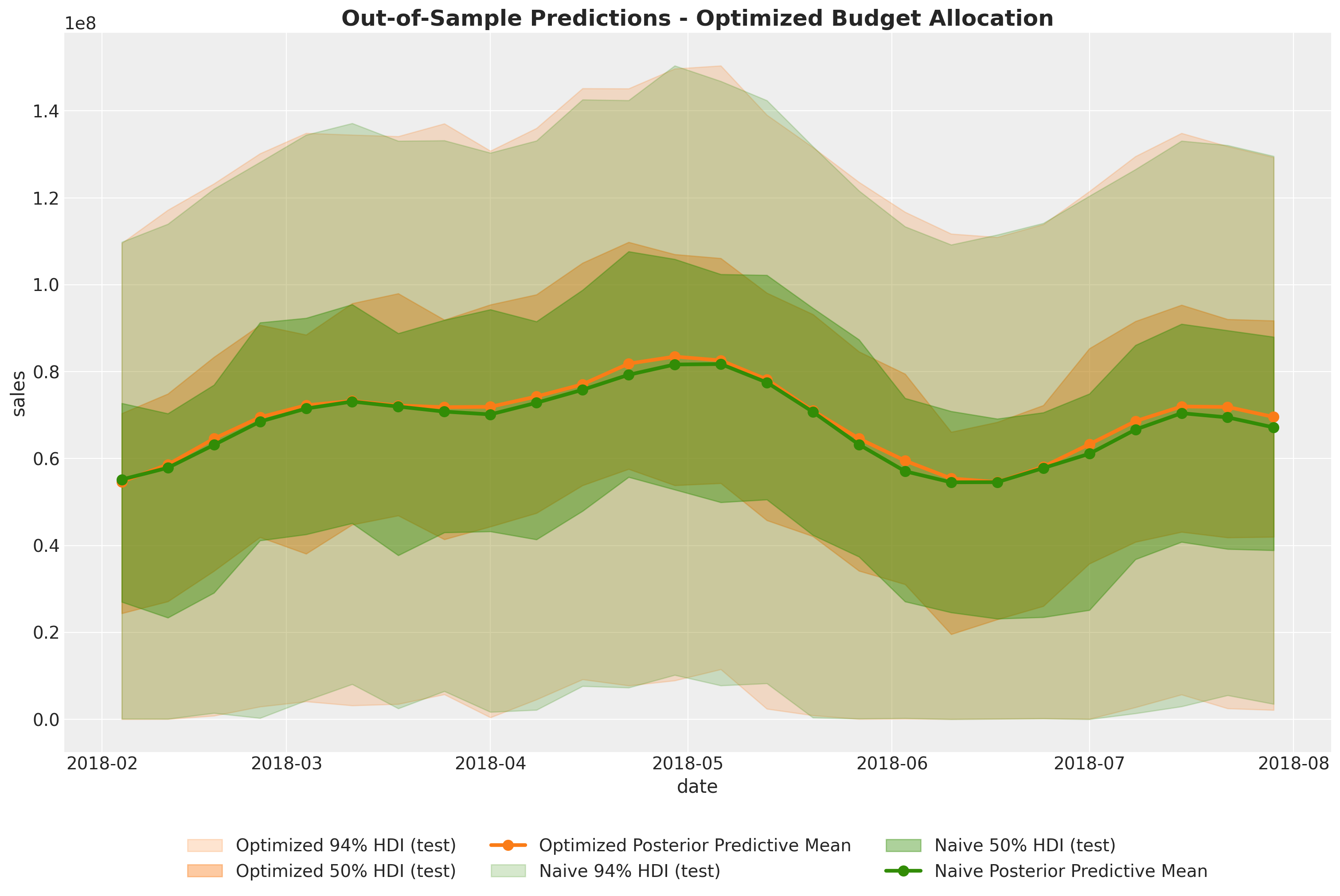
We can visualize and compare the in sample and out of sample predictions.
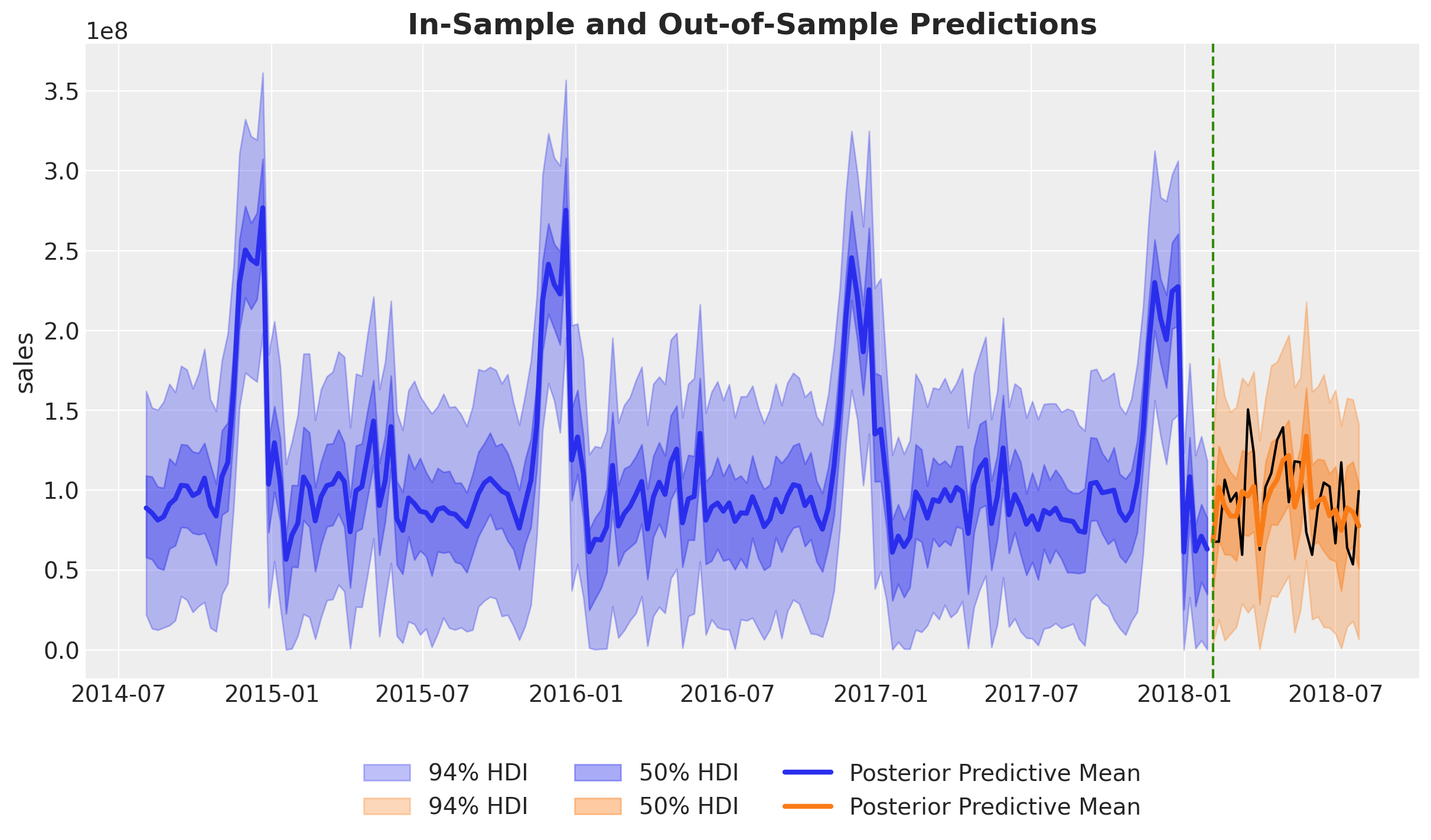
Overall, both the in-sample and out-of-sample predictions look very reasonable.
Let’s zoom in the out-of-sample predictions:
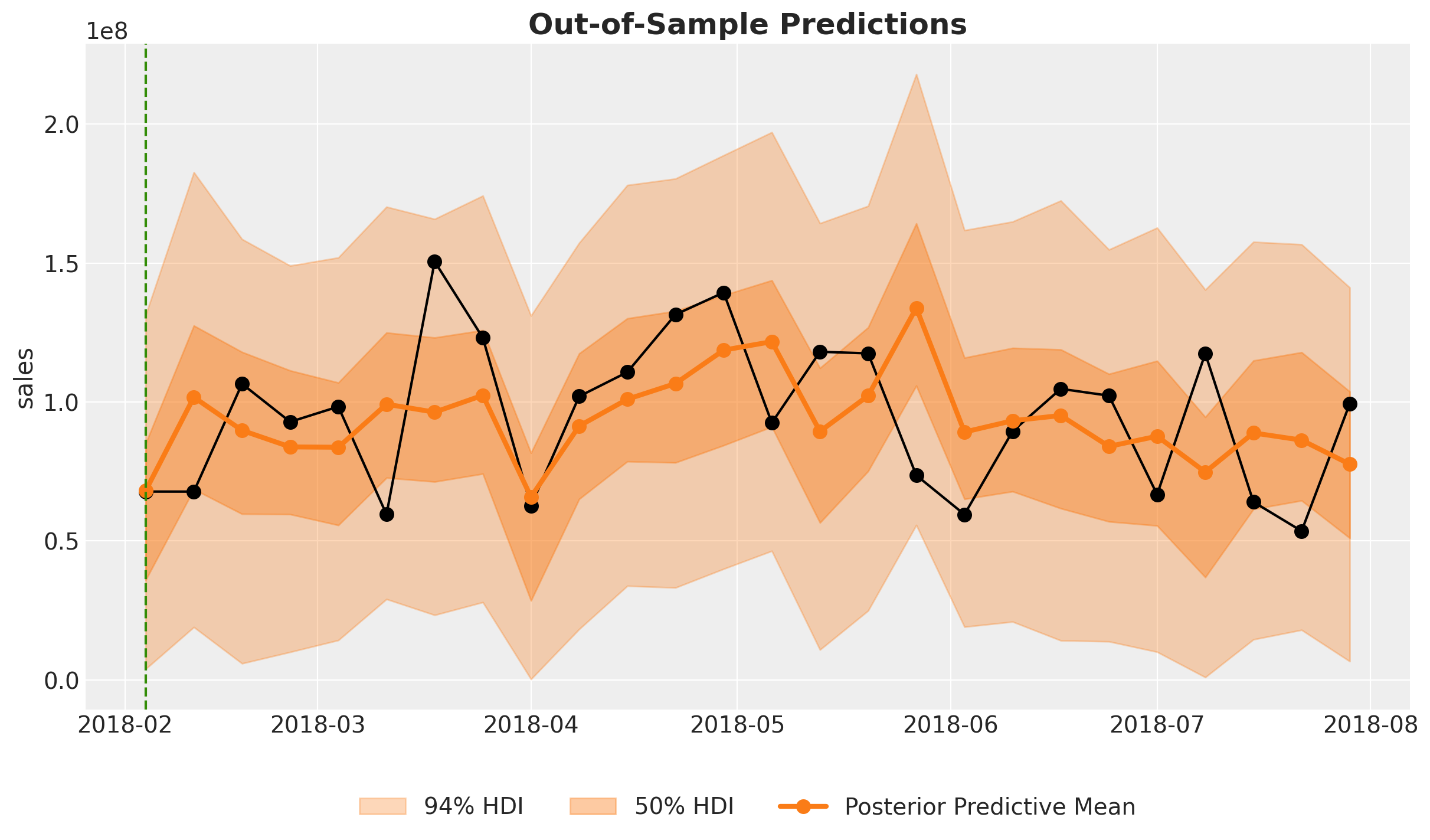
These look actually very good!
To have a concrete score metric we can use the Continuous Ranked Probability Score (CRPS). This is a generalization of the mean absolute error to the case of probabilistic predictions. For more detail see the Time-Slice-Cross-Validation and Parameter Stability notebook.
crps_train = crps(
    y_true=y_train.to_numpy(),
    y_pred=az.extract(mmm.idata["posterior"], var_names=["y_original_scale"]).T,
)

crps_test = crps(y_true=y_test.to_numpy(), y_pred=y_pred_test["y_original_scale"].T)

fig, ax = plt.subplots(figsize=(10, 6))
ax.bar(["Train", "Test"], [crps_train, crps_test], color=["C0", "C1"])
ax.set(ylabel="CRPS", title="CRPS Score");
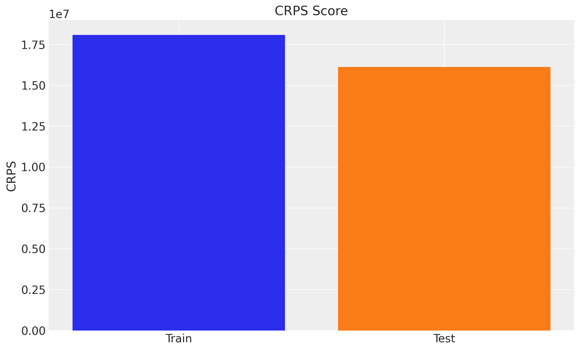
Interestingly enough, the model performance is better in the test set. There could be many reasons for it:
The model is not capturing the end of the seasonality very well in the training set.
There is less variability or complexity in the test set data.
The test set has fewer points, which could affect the CRPS calculation comparison.
In order to have a better comparison we should look into the time slice cross validation results as in the Time-Slice-Cross-Validation and Parameter Stability notebook.
Next, we look into the out-of-sample channel contributions.
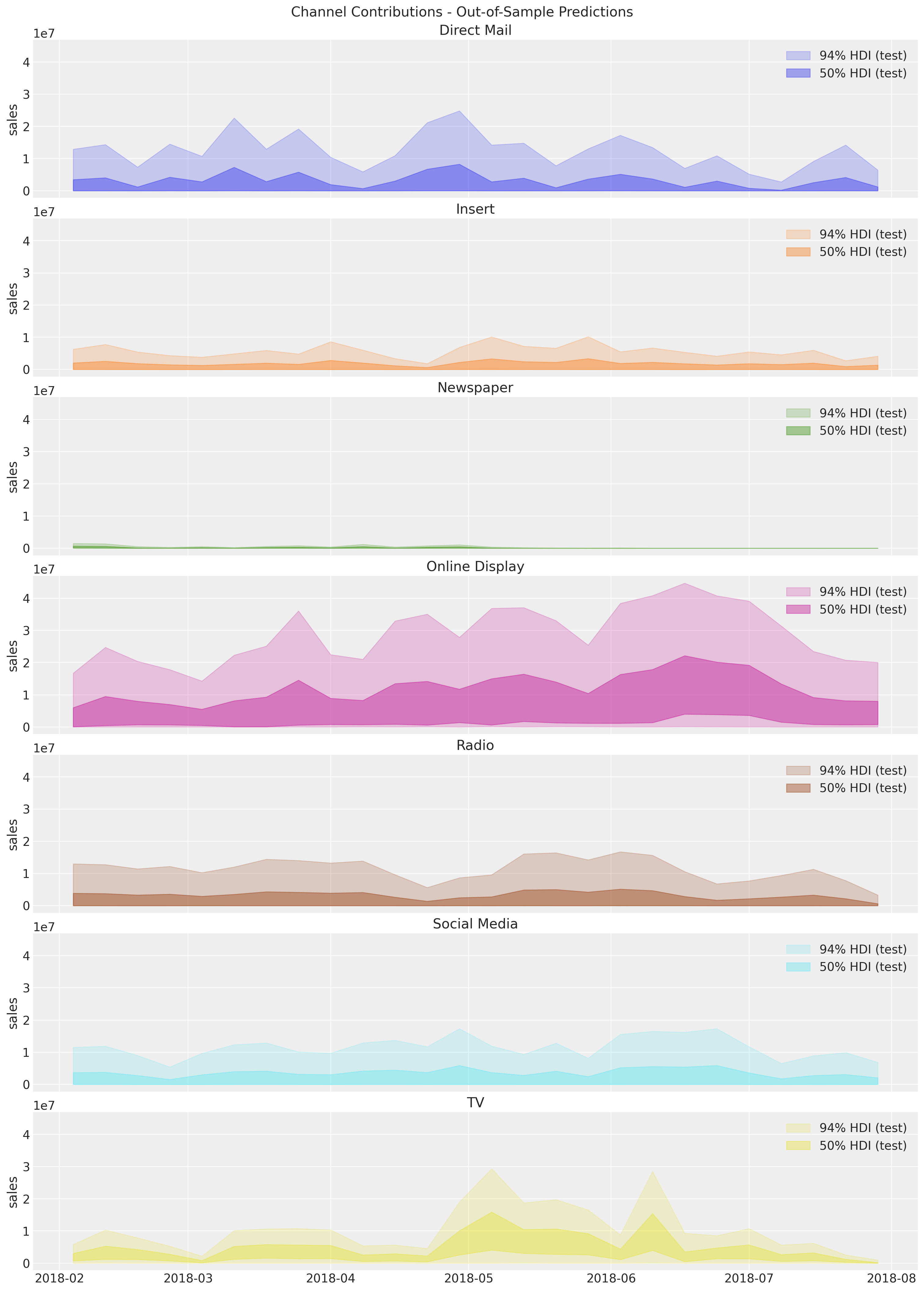
We do not have the true values contributions to compare against because this is what we are trying to estimate on the first place. Nevertheless, we can still do the time slice cross validation at the channel level to analyze the stability of the out-of-sample predictions and media parameters (adstock and saturation).
Budget Optimization#
In this last section we explain how to use PyMC-Marketing to perform optimization of the media budget allocation. The main idea is to use the response curves to optimize the spend. For more details see Budget Allocation with PyMC-Marketing notebook.
Business Value: Budget optimization quantifies the expected uplift from reallocating spend across channels. This analysis helps stakeholders understand both the potential gains and the associated uncertainty, enabling data-driven budget decisions with clear risk considerations.
Optimization Procedure#
For this example, let us assume we want to re-allocate the budget of the tests set. The PyMC-Marketing MMM optimizer would assume we will equally allocate the budget to all channels over the next num_periods periods. Hence, when we specify the budget variable we are actually specifying the weekly budget (in this case). Therefore, it is important to understand the past average weekly spend per channel:
X_test[channel_columns].sum(axis=0)
Direct Mail       12107275.13
Insert             1065383.05
Newspaper           273433.16
Online Display     6498301.30
Radio              3384098.82
Social Media       4298913.23
TV                 2610543.53
dtype: float64
num_periods = X_test[date_column].shape[0]

# Total budget for the test set per channel
all_budget_per_channel = X_test[channel_columns].sum(axis=0)

# Total budget for the test set
all_budget = all_budget_per_channel.sum()

# Weekly budget for each channel
# We are assuming we do not know the total budget allocation in advance
# so this would be the naive "uniform" allocation.
per_channel_weekly_budget = all_budget / (num_periods * len(channel_columns))
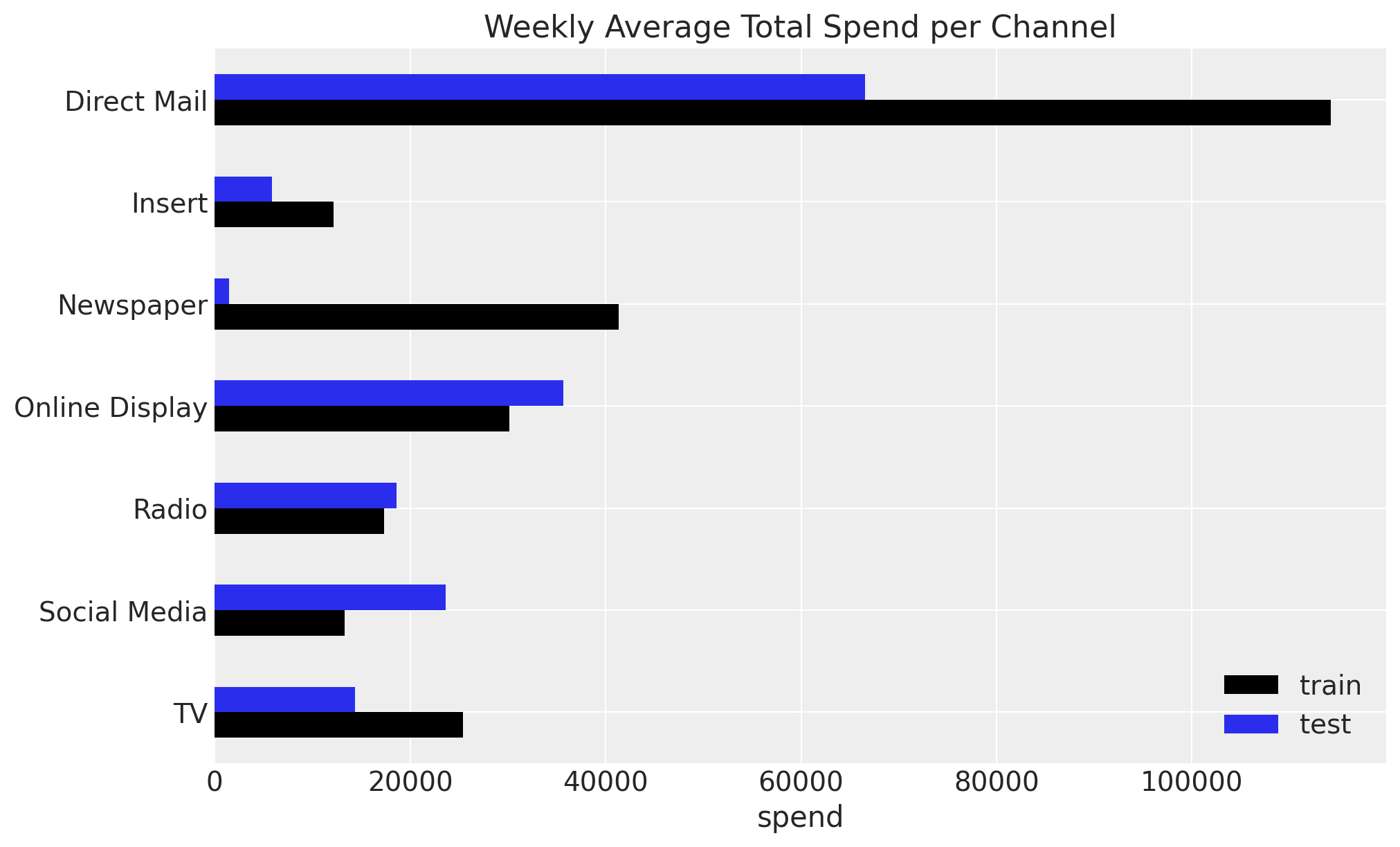
Let’s plot the average weekly spend per channel for the actual test set.
fig, ax = plt.subplots()
(
    all_budget_per_channel.div(num_periods * len(channel_columns))
    .sort_index(ascending=False)
    .plot.barh(color="C0", ax=ax)
)
ax.set(title=f"Weekly Average Total Spend per Channel (Next {num_periods} periods)");
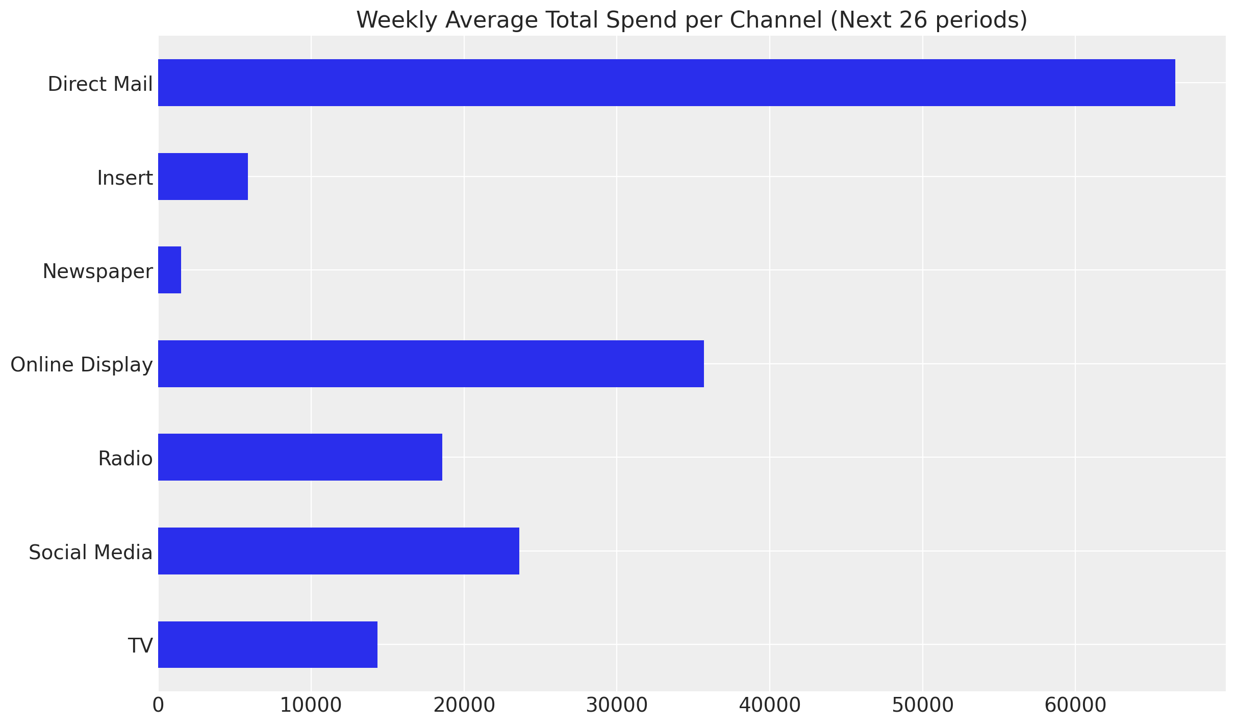
Observe that the spend distribution on the test set is considerably different from the train set. When planning future spends, this is usually the case as the team might be exploring new investment opportunities. For example, in the test set we have on average more spend on Online Display while less spend on Insert, both with high ROAS from the training data.
average_spend_per_channel_train = X_train[channel_columns].sum(axis=0) / (
    X_train.shape[0] * len(channel_columns)
)

average_spend_per_channel_test = X_test[channel_columns].sum(axis=0) / (
    X_test.shape[0] * len(channel_columns)
)

fig, ax = plt.subplots(figsize=(10, 6))
average_spend_per_channel_train.to_frame(name="train").join(
    other=average_spend_per_channel_test.to_frame(name="test"),
    how="inner",
).sort_index(ascending=False).plot.barh(color=["black", "C0"], ax=ax)
ax.set(title="Weekly Average Total Spend per Channel", xlabel="spend");
Next, let’s talk about the variability of the allocation. Even if the model finds Insert as the most efficient channel, strategically is very hard to simply put \(100\%\) of the budget into this channel. A better strategy, which generally plays well with the stakeholders, is to allow a custom degree of flexibility and some upper and lower bounds for each channel budget.
For example, we will allow a \(50\%\) difference on the past average weekly spend for each channel.
Note
Why 50% flexibility?
The choice of 50% budget flexibility is a practical compromise between optimization potential and business constraints:
Operational feasibility: Media teams typically cannot execute drastic budget shifts overnight due to contracts, inventory, and planning cycles
Risk management: Limiting changes reduces exposure if the model’s predictions don’t hold in practice
Stakeholder acceptance: Moderate changes are easier to approve and implement incrementally
Model uncertainty: Given the wide HDI intervals for some channels, conservative reallocation is prudent
In practice, this constraint should be determined collaboratively with marketing stakeholders based on organizational flexibility and risk tolerance. Some teams may start with 20-30% flexibility and increase it as confidence in the model grows.
percentage_change = 0.5

mean_spend_per_period_test = (
    X_test[channel_columns].sum(axis=0).div(num_periods * len(channel_columns))
)

budget_bounds = {
    key: [(1 - percentage_change) * value, (1 + percentage_change) * value]
    for key, value in (mean_spend_per_period_test).to_dict().items()
}

budget_bounds_xr = xr.DataArray(
    data=list(budget_bounds.values()),
    dims=["channel", "bound"],
    coords={
        "channel": list(budget_bounds.keys()),
        "bound": ["lower", "upper"],
    },
)

budget_bounds_xr
<xarray.DataArray (channel: 7, bound: 2)> Size: 112B
array([[33261.74486264, 99785.23458791],
       [ 2926.87651099,  8780.62953297],
       [  751.19      ,  2253.57      ],
       [17852.4760989 , 53557.4282967 ],
       [ 9296.97478022, 27890.92434066],
       [11810.20118132, 35430.60354396],
       [ 7171.82288462, 21515.46865385]])
Coordinates:
  * channel  (channel) <U14 392B 'Direct Mail' 'Insert' ... 'Social Media' 'TV'
* bound (bound) <U5 40B 'lower' 'upper'Now we are ready to pass all this business requirements to the optimizer.
# Get the test date range for optimization
start_date = X_test[date_column].min()
end_date = X_test[date_column].max()

# Create the wrapper
optimizable_model = MultiDimensionalBudgetOptimizerWrapper(
    model=mmm,
    start_date=str(start_date),
    end_date=str(end_date),
)

allocation_strategy, optimization_result = optimizable_model.optimize_budget(
    budget=per_channel_weekly_budget,
    budget_bounds=budget_bounds_xr,
    minimize_kwargs={
        "method": "SLSQP",
        "options": {"ftol": 1e-4, "maxiter": 10_000},
    },
)

# Sample response distribution
response = optimizable_model.sample_response_distribution(
    allocation_strategy=allocation_strategy,
    additional_var_names=[
        "channel_contribution_original_scale",
        "y_original_scale",
    ],
    include_last_observations=True,
    include_carryover=True,
    noise_level=0.05,
)
/Users/juanitorduz/Documents/pymc-marketing/pymc_marketing/mmm/budget_optimizer.py:745: UserWarning: Using default equality constraint
  self.set_constraints(
Sampling: [y]
Tip
The optimize_budget method has a parameter:
budget_distribution_over_period : xr.DataArray | None is the distribution factors for budget allocation over time. Should have dims ("date", *budget_dims) where date dimension has length num_periods. Values along date dimension should sum to 1 for each combination of other dimensions. If None, budget is distributed evenly across periods.
This is important as we, apriori, do not know how the budget distribution will fluctuate over time. A uniform distribution is a good starting point as it is simple and does not require any additional information. However, if you have very seasonal media spend (e.g. holidays or seasonality) you might want to use a more informative distribution.
Let’s visualize the results.
fig, ax = plt.subplots()

contribution_comparison_df = (
    pd.Series(allocation_strategy, index=mean_spend_per_period_test.index)
    .to_frame(name="optimized_allocation")
    .join(mean_spend_per_period_test.to_frame(name="initial_allocation"))
    .sort_index(ascending=False)
)
contribution_comparison_df.plot.barh(figsize=(12, 8), color=["C1", "C0"], ax=ax)
ax.set(title="Budget Allocation Comparison", xlabel="allocation");
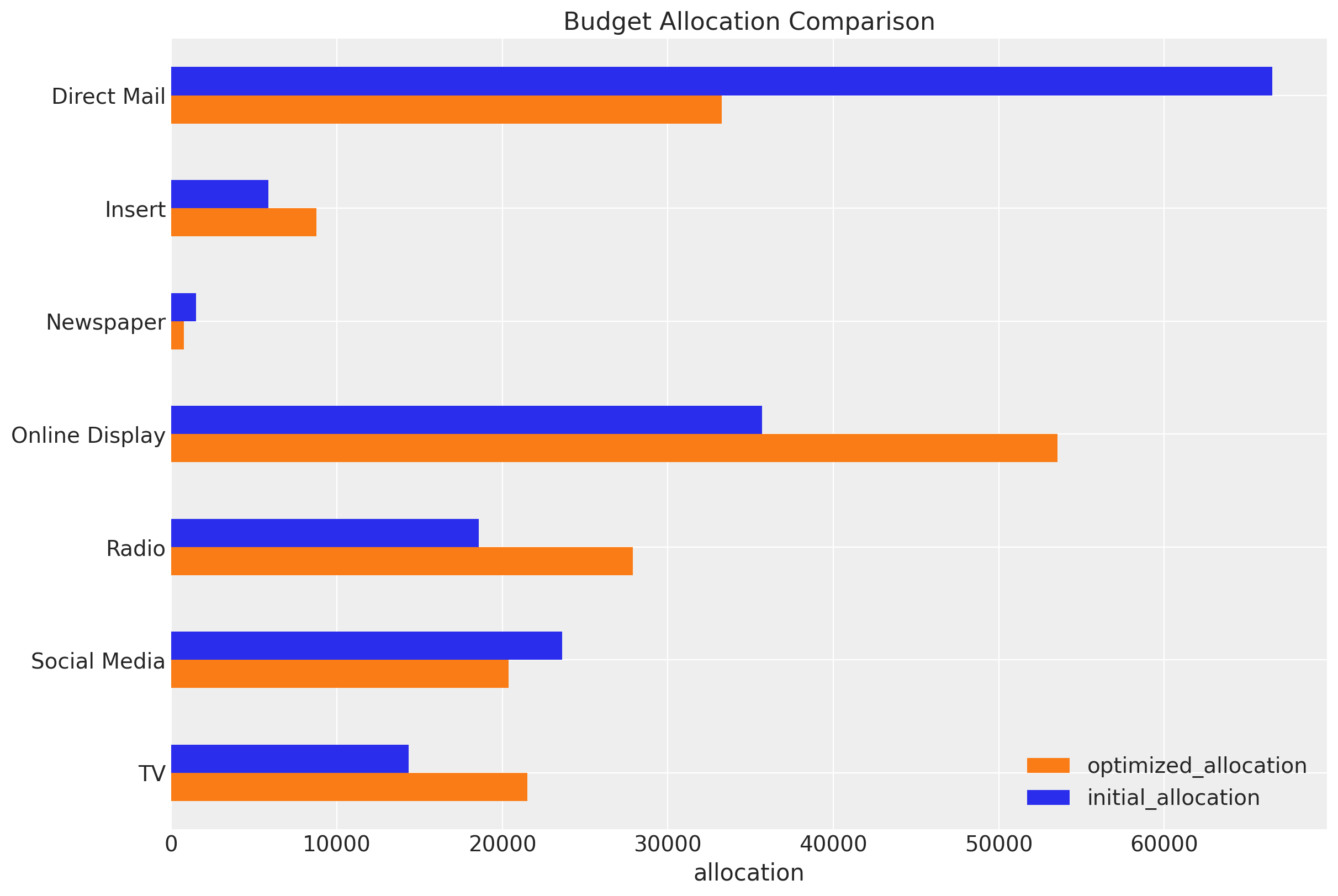
The optimizer is essentially shifting budget from saturated channels to channels operating on the steeper (more efficient) part of their saturation curves. Direct Mail’s saturation scatterplot shows a clear “elbow” - spending beyond that point yields minimal incremental contribution. Meanwhile, Online Display’s more linear scatterplot indicates it hasn’t yet hit diminishing returns territory.
Other three channels (TV, Radio, Insert) share a key characteristic: they were operating below their saturation points while Direct Mail was pushed past its efficient operating range. The optimizer essentially said: “Stop over-investing in saturated channels and spread that budget to these three underutilized, high-marginal-return channels.”
This is textbook marketing mix optimization: equalize marginal returns across channels by reducing overspent (saturated) channels and increasing underspent (high-marginal-return) channels.
We verify that the sum of the budget allocation is the same as the initial budget.
np.testing.assert_allclose(
    mean_spend_per_period_test.sum(), allocation_strategy.sum().item()
)
We can also obtain the average expected contributions per channel with the new budget allocation.
fig, ax = optimizable_model.plot.budget_allocation(samples=response, figsize=(12, 8))
/Users/juanitorduz/Documents/pymc-marketing/pymc_marketing/mmm/plot.py:1873: UserWarning: The figure layout has changed to tight
  fig.tight_layout()
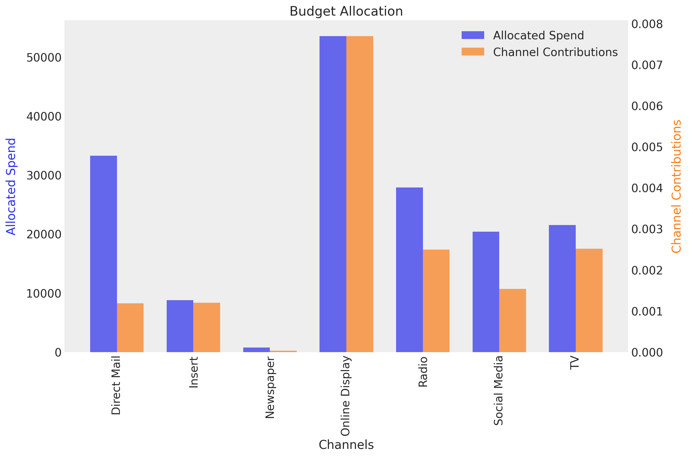
Here we see how the spend on TV is fixed at zero as we specified.
In-Sample Optimization Results#
The first business question that we can answer is how the optimized budget allocation would have performed in the training set. Of course, we expect an uplift as compared to the initial allocation. How to do this? As a result of the optimization, we have the posterior distribution share of the optimized allocation. Hence we can:
Compute the mean of these share to obtain a single optimized allocation distribution.
Re-weight the original training data with the optimized allocation distribution.
Compute the posterior predictive with the optimized data.
Compare the optimized posterior predictive with the initial posterior predictive.
Let’s do this step by step.
First, we compute the mean of the optimized allocation share.
shares_comparison_df = contribution_comparison_df / contribution_comparison_df.sum(
    axis=0
)

shares_comparison_df = shares_comparison_df.assign(
    # We can compute the multiplier as the ratio of the optimized to the initial allocation.
    # This will be used to re-weight the original training data.
    multiplier=lambda df: df["optimized_allocation"] / df["initial_allocation"]
)

shares_comparison_df
| optimized_allocation | initial_allocation | multiplier | |
|---|---|---|---|
| TV | 0.129500 | 0.086333 | 1.500000 |
| Social Media | 0.122697 | 0.142169 | 0.863033 |
| Radio | 0.167873 | 0.111916 | 1.500000 |
| Online Display | 0.322358 | 0.214905 | 1.500000 |
| Newspaper | 0.004521 | 0.009043 | 0.500000 |
| Insert | 0.052850 | 0.035233 | 1.500000 |
| Direct Mail | 0.200200 | 0.400400 | 0.500000 |
We now re-weight the original training data with the optimized allocation distribution. It is very important to ensure the total spend is the same as in the original data (we do this by normalizing the total spend in the optimized data to be the same as in the original data).
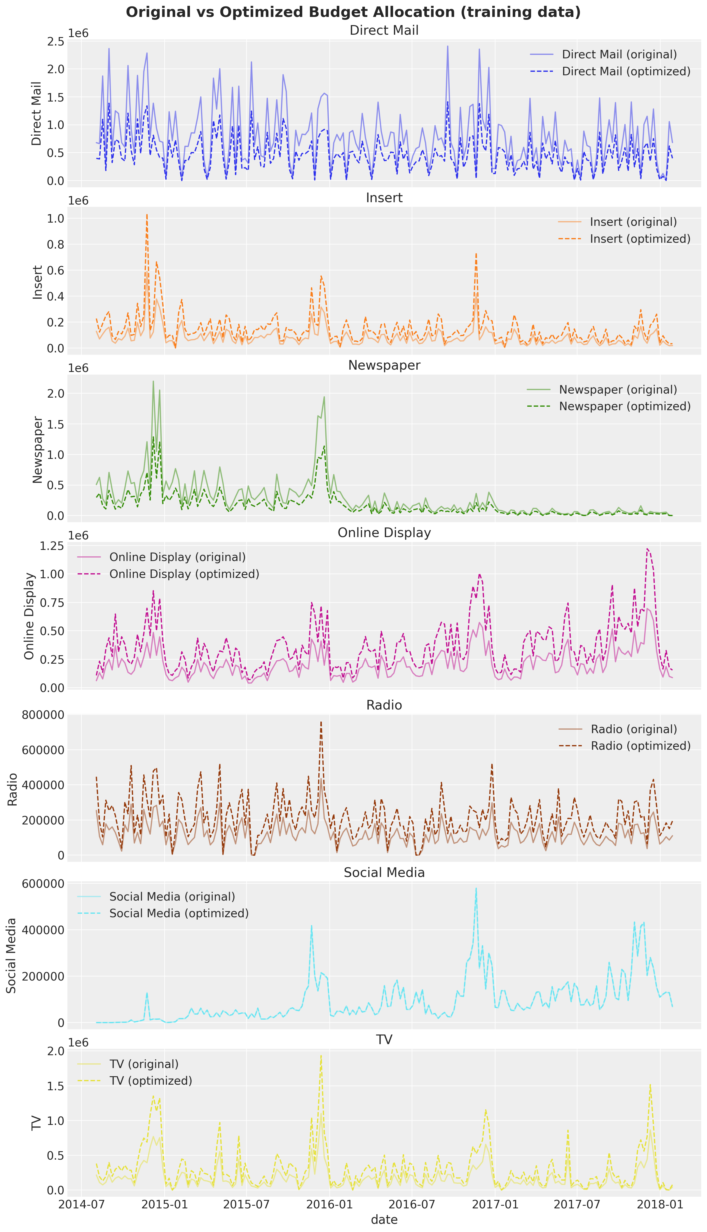
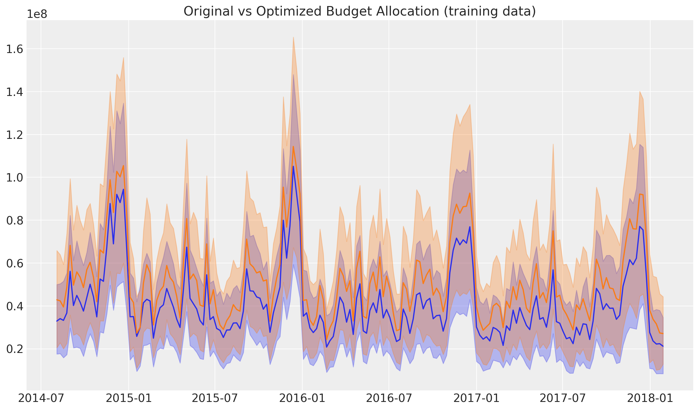
X_train_weighted = X_train.copy()

# We re-weight the original training data with the optimized allocation distribution.
for channel in channel_columns:
    channel_multiplier = shares_comparison_df[shares_comparison_df.index == channel][
        "multiplier"
    ].item()
    X_train_weighted[channel] = X_train_weighted[channel] * channel_multiplier

# We normalize the total spend in the optimized data to be the same as in the original data.
normalization_factor = (
    X_train[channel_columns].sum().sum() / X_train_weighted[channel_columns].sum().sum()
)

# We apply the normalization factor to the optimized data.
X_train_weighted[channel_columns] = (
    X_train_weighted[channel_columns] * normalization_factor
)

# We validate that the total spend is the same as in the original data.
np.testing.assert_allclose(
    X_train_weighted[channel_columns].sum().sum(),
    X_train[channel_columns].sum().sum(),
)
We can now visualize the original and optimized training data.
Next, we compute the posterior predictive for the original and optimized data.
y_pred_train = mmm.sample_posterior_predictive(
    X_train,
    var_names=["y_original_scale", "channel_contribution_original_scale"],
    extend_idata=False,
    progressbar=False,
    random_seed=rng,
)

y_pred_train_weighted = mmm.sample_posterior_predictive(
    X_train_weighted,
    var_names=["y_original_scale", "channel_contribution_original_scale"],
    extend_idata=False,
    progressbar=False,
    random_seed=rng,
)
Sampling: [y]
Sampling: [y]
Finally, we can compare the original and optimized posterior predictive distributions. First we look at the channel contributions level.
It is clear that the optimized allocation has a higher contribution level. We can quantify this by computing the uplift in the channel contributions.
uplift = (
    y_pred_train_weighted["channel_contribution_original_scale"]
    .sum(dim=("date", "channel"))
    .unstack()
    / y_pred_train["channel_contribution_original_scale"]
    .sum(dim=("date", "channel"))
    .unstack()
) - 1

fig, ax = plt.subplots(figsize=(10, 6))
az.plot_posterior(
    uplift, var_names=["channel_contribution_original_scale"], ref_val=0, ax=ax
)
ax.set_title("Uplift in Channel Contributions after Optimization", fontsize=16);
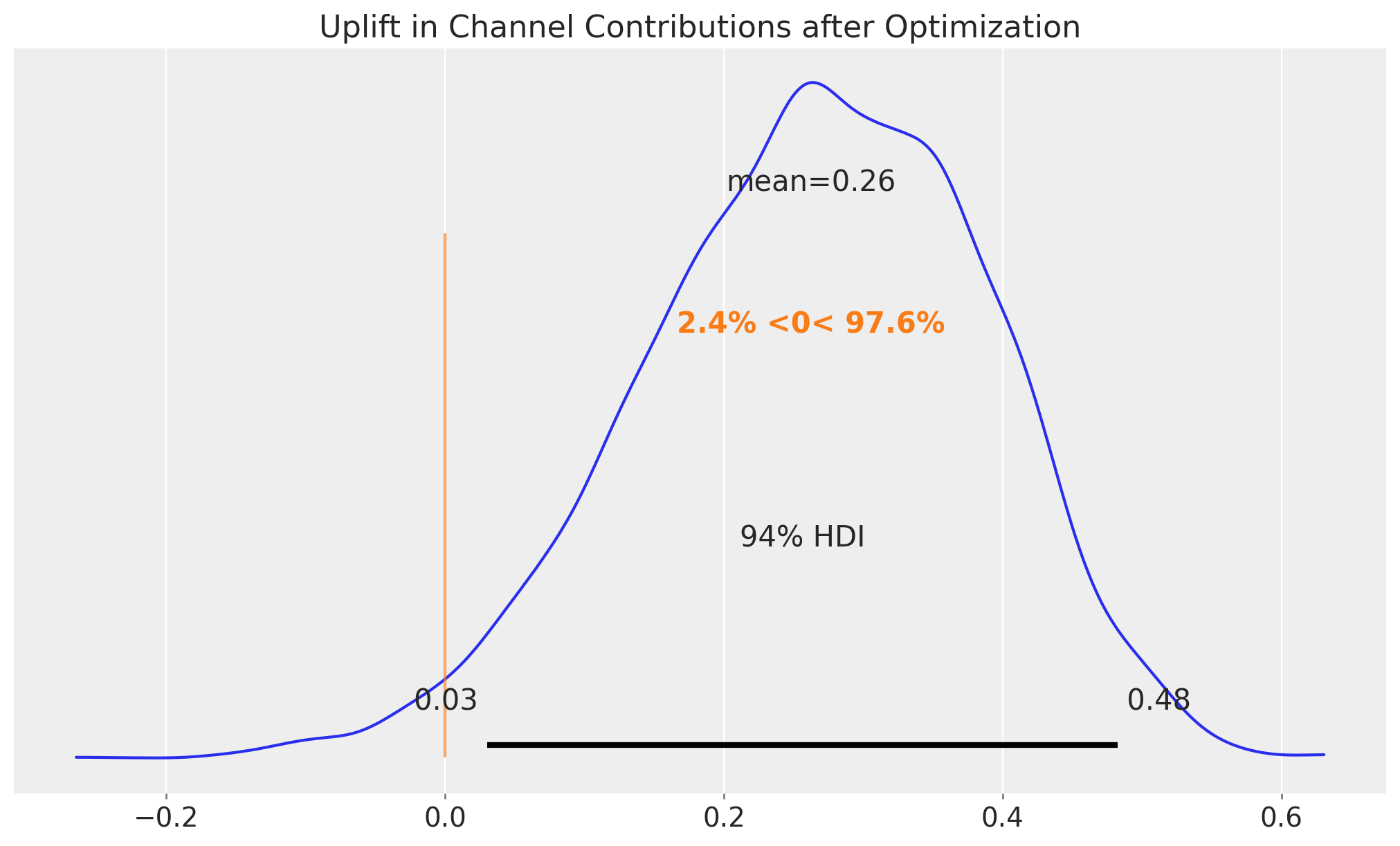
We see that the uplift is around \(26\%\), which is remarkable in view of the typical figures in marketing spend. This would have made our media much more efficient.
Business Value: A 26% uplift in channel contributions represents significant potential value. For a business with millions in marketing spend, this translates to substantial incremental revenue. However, it’s important to communicate that this is an in-sample estimate - actual out-of-sample performance may vary.
Note
The orange line and corresponding range compares these posterior samples to the reference value of zero. Hence, we have a probability of more than \(96.7\%\) that the optimized allocation will perform better than the initial allocation.
Finally, we can look at the uplift in sales.
We also see an uplift in sales, although the difference is masked by the model uncertainty itself. Nevertheless, we can compute the uplift in sales as well.
uplift = (
    y_pred_train_weighted["y_original_scale"].sum(dim=("date")).unstack()
    / y_pred_train["y_original_scale"].sum(dim=("date")).unstack()
) - 1

fig, ax = plt.subplots(figsize=(10, 6))
az.plot_posterior(uplift, var_names=["y_original_scale"], ref_val=0, ax=ax)
ax.set_title("Uplift in Sales after Optimization", fontsize=16);
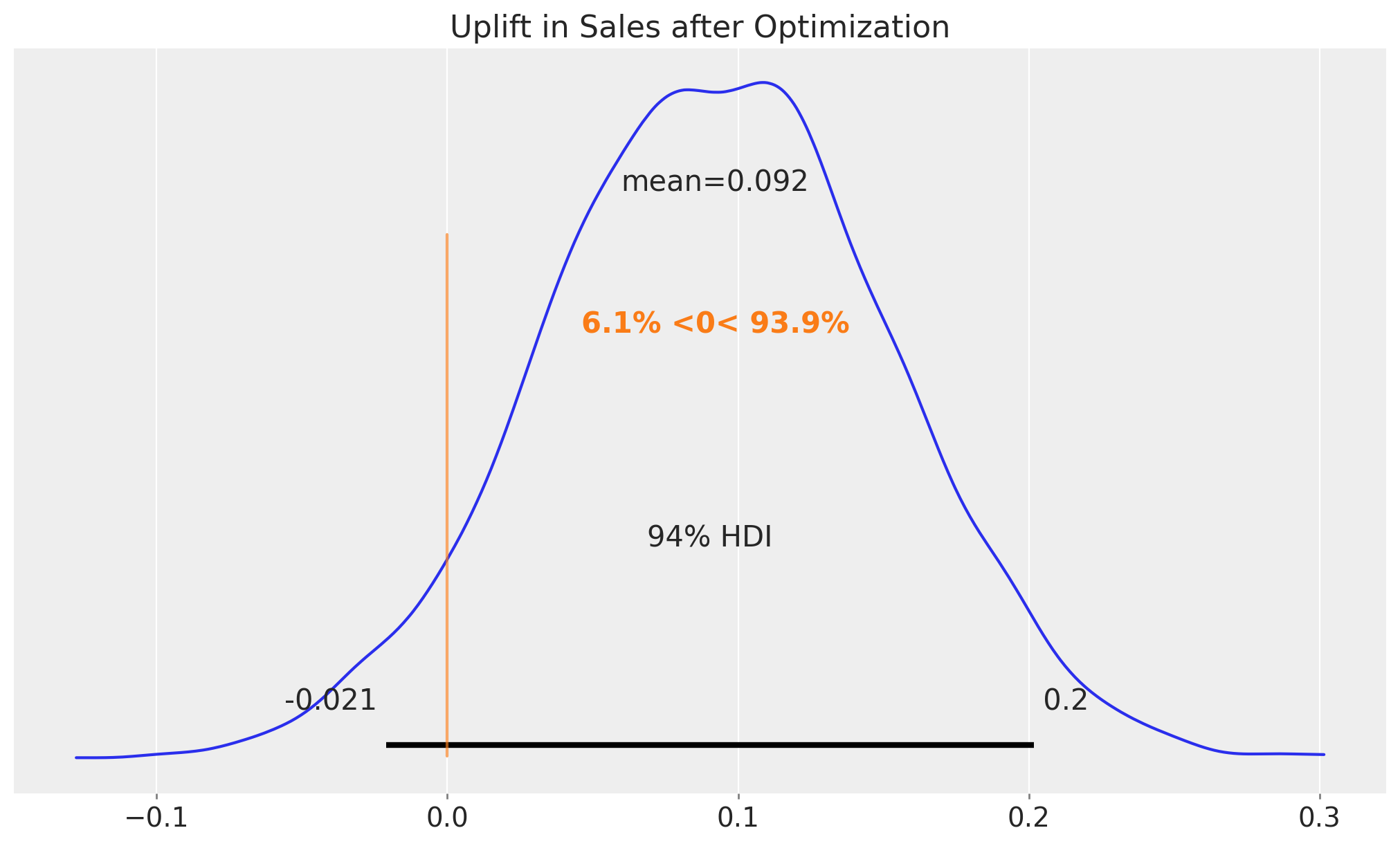
The result is about \(10\%\) which is also quite an achievement (multiply this by millions of dollars!).
Business Value: A 10% sales uplift from budget reallocation, without increasing total spend, demonstrates the power of data-driven optimization. This analysis provides concrete evidence for stakeholders to support strategic budget shifts.
Note
Practical Implementation Challenges: While the optimization shows promising results, real-world implementation faces challenges:
Budget constraints may prevent immediate reallocation
Channel capacity limits (e.g., inventory, reach) may constrain increases
Organizational inertia and stakeholder buy-in require time
Market conditions may change, affecting channel effectiveness These factors should be considered when presenting recommendations to business stakeholders.
Out-of-Sample Optimization Results#
Now that we have seen the results in-sample, let’s look at the out-of-sample results. We can not use the same optimization strategy as before as we do not have the future data. In particular, we can not know the future fluctuations (that being said, we can always do the prediction based on simulations or media planning).
Instead, we will use a uniform allocation strategy for the test set.
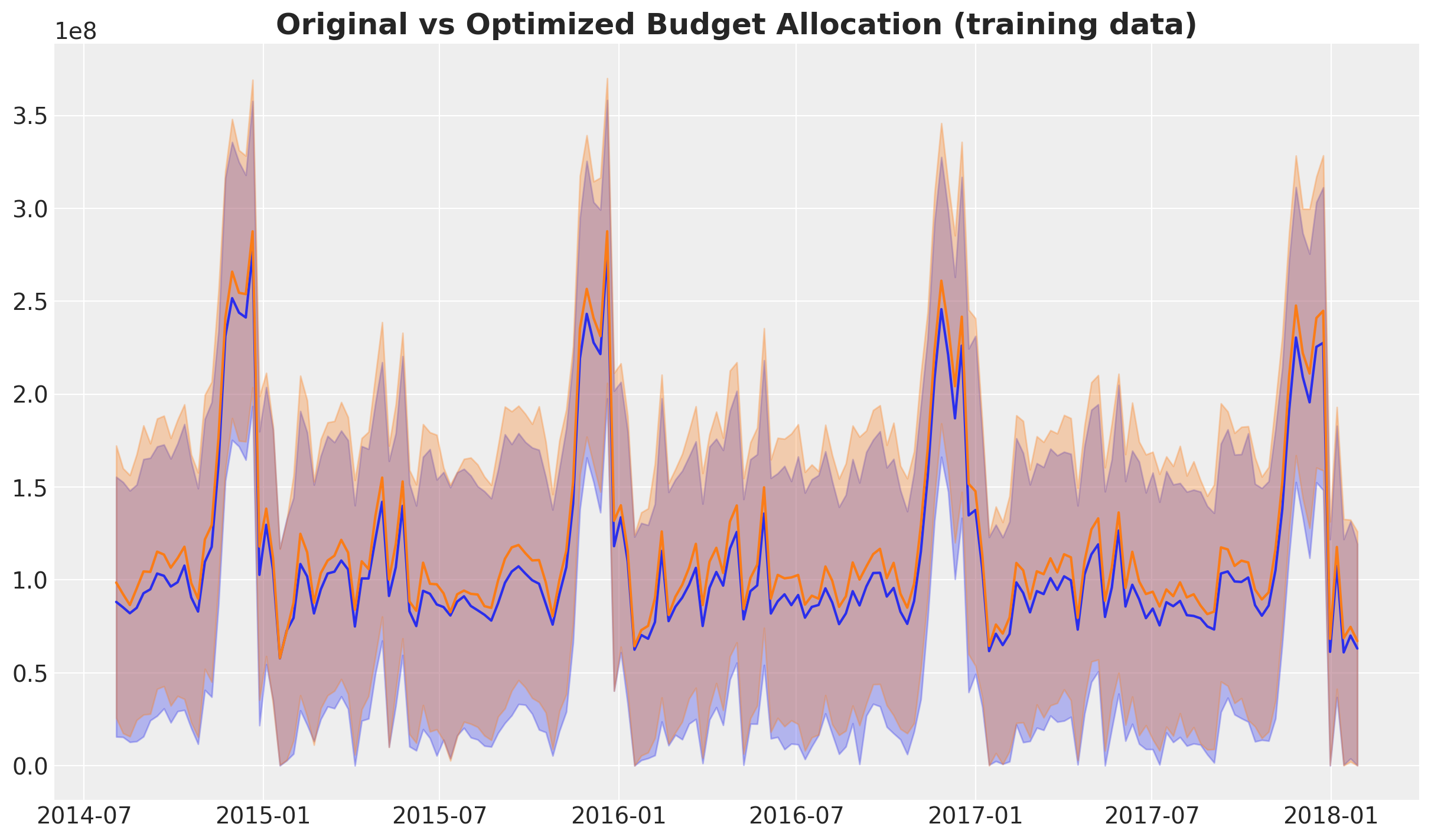
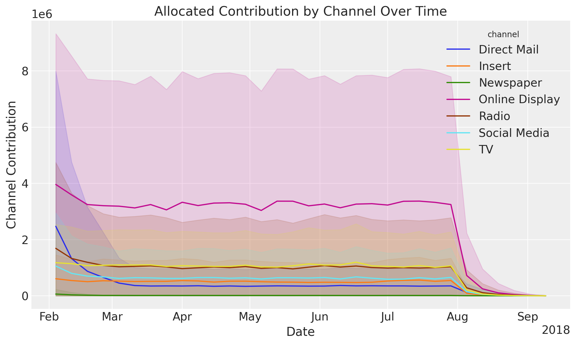
fig, ax = mmm.plot.allocated_contribution_by_channel_over_time(response)
/Users/juanitorduz/Documents/pymc-marketing/pymc_marketing/mmm/plot.py:2264: UserWarning: The figure layout has changed to tight
  fig.tight_layout()
Note
Here are some remarks:
Observe that uncertainty increases given the new level of spending. For example, historically spending for
Online Displaywas in between \(200\)K to \(250\)K and we are now recommending around \(350\)K. The fact that this spend level has not been reached before is reflected in the increased uncertainty.The plot shows the adstock effect at the end of the test period.
Similarly as in the in-sample case, we want to compare the expected optimized budget allocation with the initial allocation. We compare this at two levels:
Channel contributions: We compute the difference between the optimized and naive channel contributions from the posterior predictive samples.
Total Sales: We compute the difference between the optimized and naive total sales from the posterior predictive samples. In this case we include the intercept and seasonality, but we set the control variables to zero as in many cases we do not have them for the future.
Channel Contribution Comparison#
The first thing we need to do is to compute the naive channel contributions for the test period. We do this by simply setting these values as uniform across the test period and then using the model (trained on the training period) to compute the expected channel contributions.
X_actual_uniform = X_test.copy()

for channel in channel_columns:
    X_actual_uniform[channel] = mean_spend_per_period_test[channel]

for control in control_columns:
    X_actual_uniform[control] = 0.0

pred_test_uniform = mmm.sample_posterior_predictive(
    X_actual_uniform,
    include_last_observations=True,
    var_names=["y_original_scale", "channel_contribution_original_scale"],
    extend_idata=False,
    progressbar=False,
    random_seed=rng,
)
Sampling: [y]
Let’s visualize the optimized and naive channel contributions.
We see indeed that the optimized allocation strategy is more efficient regarding the aggregated channel contributions. This is exactly what we were looking for!
We can quantify the percentage improvement of the optimized allocation by comparing the two posterior distributions aggregated over time.
fig, ax = plt.subplots()
az.plot_posterior(
    (
        response_channel_contribution_original_scale.sum(dim="date")
        - pred_test_uniform["channel_contribution_original_scale"]
        .unstack()
        .sum(dim="channel")
        .transpose(..., "date")
        .sum(dim="date")
    )
    / response_channel_contribution_original_scale.sum(dim="date"),
    ref_val=0,
    ax=ax,
)
ax.xaxis.set_major_formatter(plt.FuncFormatter(lambda x, _: f"{x:.0%}"))
ax.set_title(
    "Channel Contribution\nDifference between optimized and initial allocation",
    fontsize=18,
    fontweight="bold",
);
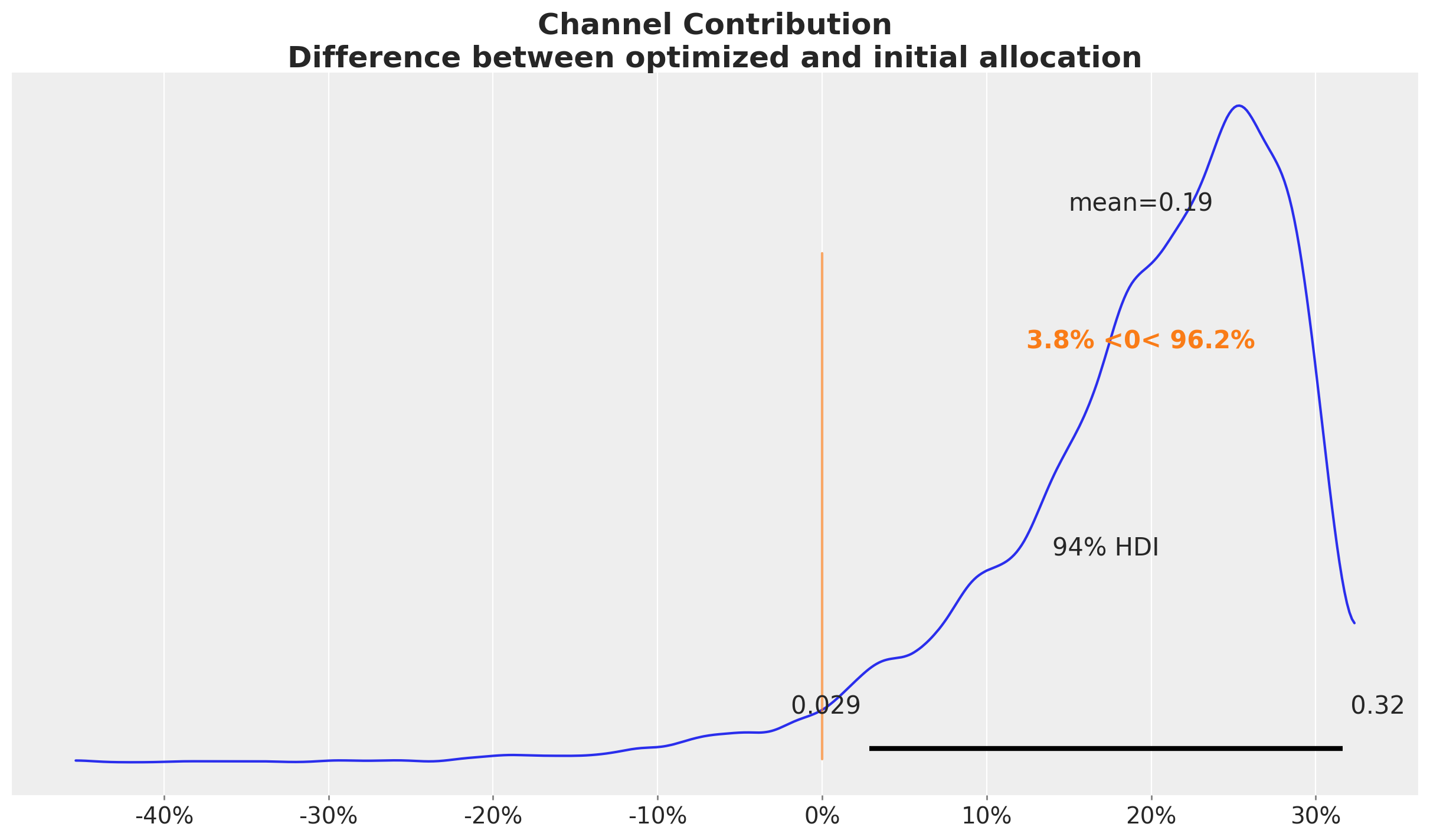
Concretely, we see an approximately \(20\%\) increase in the aggregated channel contributions. This could result in a significant increase in monetary value!
This result is very similar to the in-sample case.
Sales Comparison#
Next, we want to compare the optimized and naive total sales. The strategy is the same as in the case above. The only difference is that we add additional variables like seasonality and baseline (intercept). As mentioned above, we set the control variables to zero for the sake of comparison. This is what is done in the allocate_budget_to_maximize_response() method.
At the level of total sales, in this case the difference is negligible as the baseline and seasonality (which are the same in both cases) explain most of the variance as the average weekly media spend in this last period is much smaller as in the training set.
fig, ax = plt.subplots()
az.plot_posterior(
    (
        y_response_original_scale.sum(dim="date")
        - pred_test_uniform["y_original_scale"].unstack().sum(dim="date")
    )
    / y_response_original_scale.sum(dim="date"),
    ref_val=0,
    ax=ax,
)
ax.xaxis.set_major_formatter(plt.FuncFormatter(lambda x, _: f"{x:.0%}"))
ax.set_title(
    "Sales\nDifference between optimized and naive sales",
    fontsize=18,
    fontweight="bold",
);
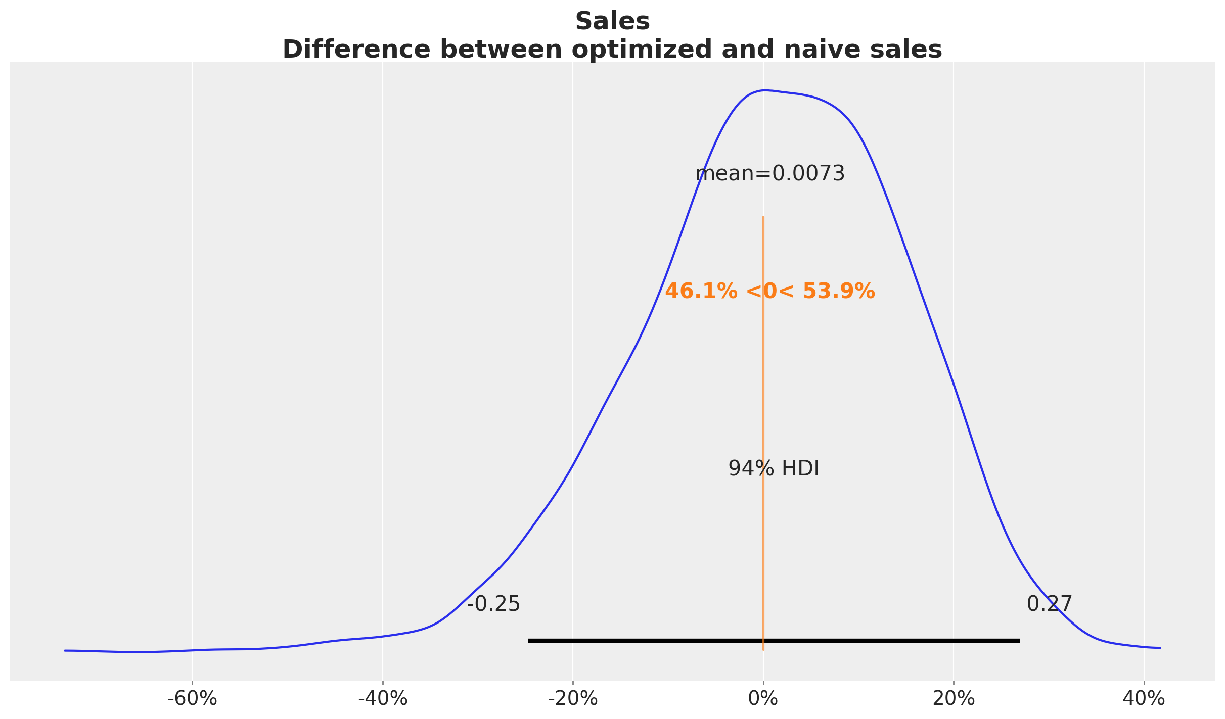
In this case we see that when we compare the posterior samples of the uplift to the reference value of zero we do not find any difference. This should not be discouraging as we did see a \(20\%\) increase in the aggregated (over time) channel contributions. This can translate to a lot of money! There is no discrepancy on the results. What we are seeing is that the constrained optimization problem where we are just allowed, because of business requirements (which is very common for many marketing teams), to change the budget up to \(50\%\) we improved the channel contributions significantly but not at the same order of magnitude of the other model components.
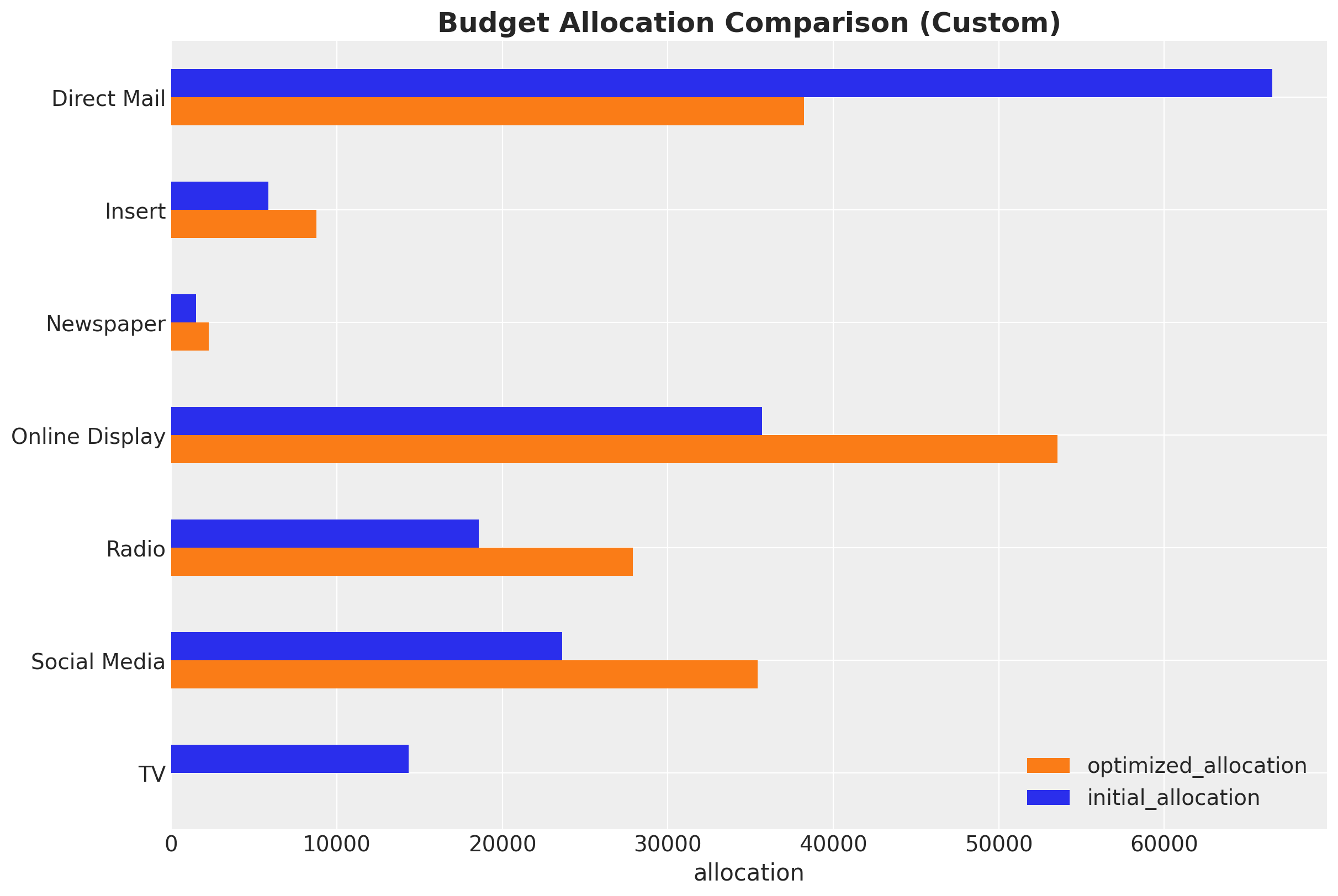
Custom Budget Constraints#
Tip
The MMM optimizer is able to handle custom budget constraints. For example, we can force the optimizer to fix the spend on TV at zero:
# Mask TV as we do not want to optimize it
# we are going to force the optimizer to fix this
# at zero spend
budgets_to_optimize = xr.DataArray(
    np.array([True, True, True, True, True, True, False]),
    dims=["channel"],
    coords={
        "channel": channel_columns,
    },
)

allocation_strategy_custom, optimization_result_custom = (
    optimizable_model.optimize_budget(
        budget=per_channel_weekly_budget,
        budget_bounds=budget_bounds_xr,
        budgets_to_optimize=budgets_to_optimize,
        minimize_kwargs={
            "method": "SLSQP",
            "options": {"ftol": 1e-4, "maxiter": 10_000},
        },
    )
)

# Sample response distribution
response_custom = optimizable_model.sample_response_distribution(
    allocation_strategy=allocation_strategy_custom,
    additional_var_names=[
        "channel_contribution_original_scale",
        "y_original_scale",
    ],
    include_last_observations=True,
    include_carryover=True,
    noise_level=0.05,
)

# Check that the total spend is the same
np.testing.assert_allclose(
    mean_spend_per_period_test.sum(), allocation_strategy_custom.sum().item()
)

# Plot the results
fig, ax = plt.subplots()
contribution_comparison_df = (
    pd.Series(allocation_strategy_custom, index=mean_spend_per_period_test.index)
    .to_frame(name="optimized_allocation")
    .join(mean_spend_per_period_test.to_frame(name="initial_allocation"))
    .sort_index(ascending=False)
)
contribution_comparison_df.plot.barh(figsize=(12, 8), color=["C1", "C0"], ax=ax)
ax.set(xlabel="allocation")
ax.set_title(
    "Budget Allocation Comparison (Custom)",
    fontsize=18,
    fontweight="bold",
);
/Users/juanitorduz/Documents/pymc-marketing/pymc_marketing/mmm/budget_optimizer.py:745: UserWarning: Using default equality constraint
  self.set_constraints(
Sampling: [y]
Conclusion#
This case study demonstrated how to leverage PyMC-Marketing’s Media Mix Modeling capabilities to gain actionable insights into marketing effectiveness and optimize budget allocation. We walked through the entire process from data preparation and exploratory analysis to model fitting, diagnostics, and budget optimization.
Key Findings and Business Impact#
Quantified Business Impact:
26% potential uplift in channel contributions from budget optimization
10% potential sales uplift through strategic budget reallocation
High-ROAS channels identified:
Online DisplayandInsertshow the highest efficiencySaturation insights:
Direct Mailis operating beyond its efficient range
Channel-Specific Insights:
Online Display: Highest ROAS, strong candidate for budget increases
Insert: High ROAS, underutilized relative to its efficiency
TV: Moderate ROAS, operating below saturation point
Direct Mail: Lowest ROAS, currently over-invested relative to efficiency
Radio, Newspaper, Social Media: Moderate performance, potential for strategic reallocation
Model Limitations and Assumptions:
Additive channel effects: The model assumes channels don’t interact (no synergy or cannibalization effects)
Stationary relationships: Channel effectiveness is assumed constant over time, which may not hold during market disruptions
Limited historical data: Some channels have sparse spend history, leading to wider uncertainty intervals
Unmodeled factors: Competitor actions, economic conditions, and other external factors are not explicitly included
Out-of-sample uncertainty: The 26% uplift is an in-sample estimate; actual performance may vary
Concrete Recommendations for Business Stakeholders:
Immediate Actions: Gradually increase budget for
Online DisplayandInsertwhile monitoring performanceBudget Reallocation: Reduce
Direct Mailspend to more efficient levels, reallocating to high-ROAS channelsValidation Strategy: Implement A/B or geo tests to validate model predictions before full-scale reallocation
Monitoring Plan: Establish regular model updates (quarterly or semi-annually) to capture changing market dynamics
Stakeholder Communication: Present findings with clear uncertainty quantification and risk considerations
Iterative Improvement: Incorporate lift test data in future iterations to improve model calibration
Next Steps#
Stakeholder engagement: Present findings to key stakeholders, focusing on actionable insights and potential business impact. Understand their feedback and iterate.
Scenario planning: Use the model to simulate various budget scenarios and market conditions to support strategic decision-making.
Integration with other tools: Explore ways to integrate the MMM insights with other marketing analytics tools and processes for a more holistic view of marketing performance.
Time-slice cross-validation: Implement a more robust validation strategy to ensure model stability and performance over time (see Time-Slice-Cross-Validation and Parameter Stability).
Iterate and refine: This analysis represents a first iteration. Future iterations could incorporate:
Lift test data to better calibrate the model (see Lift Test Calibration)
More granular data (e.g., daily instead of weekly)
Additional variables like competitor actions or macroeconomic factors
A/B (or Geo) testing: Design experiments to test the model’s recommendations and validate its predictions in the real world.
Regular updates: Establish a process for regularly updating the model with new data to keep insights current.
Explore advanced features: Investigate other PyMC-Marketing capabilities, such as incorporating time varying parameters (see MMM with time-varying parameters (TVP) and MMM with time-varying media baseline) and custom models like hierarchical levels or more complex seasonality patterns, to further refine the model (see Custom Models with MMM components).
%load_ext watermark
%watermark -n -u -v -iv -w -p pymc_marketing,pytensor,nutpie
Last updated: Fri, 23 Jan 2026

Python implementation: CPython
Python version       : 3.13.11
IPython version      : 9.9.0

pymc_marketing: 0.17.1
pytensor      : 2.36.3
nutpie        : 0.16.4

arviz         : 0.23.0
matplotlib    : 3.10.8
numpy         : 2.3.5
pandas        : 2.3.3
pymc          : 5.27.0
pymc_extras   : 0.7.0
pymc_marketing: 0.17.1
seaborn       : 0.13.2
xarray        : 2025.12.0

Watermark: 2.6.0